aspired
Connecting businesses and individuals to nonprofits around the world

Project Background:
Aspired is an early-stage startup with big dreams of building a social (change) network wherein individuals can connect and partner with nonprofit organizations and businesses around the world. The Aspired marketplace gives you point-of-sale transparency on every purchase of social goods and their platform allows you to get the word out about the causes you care about most.
My team was brought on just after a previous Springboard team wrapped up user research.
The Problem
Previous user research discovered the onboarding process for the non-profit administrators needed to be improved. The sign up process did not meet user expectations and overall the onboarding was vague and confusing with competing calls to action.
Additionally, the Aspired leadership team has set a goal of growing the number of nonprofits registered on the app from 8 to 80 by the end of 2022. Our team was tasked with improving the nonprofit onboarding user journey in order to help Aspired achieve their goal.
The Team
Frances Pimentel, UX/UI Design
Kayvan Mesbah, UX/UI Design
Abi Olmstead, UX/UI Design
Hien Nguyen, CEO
Sunil Mishra, Lead Product Manager
Phuc Phan, Front-End Developer
Tools Used:
Miro
Figma
Slack
Google Suite
Zoom
Project Timeline
4.5 Weeks
project scope

user journey
The previous UX/UI team from Springboard created a solid foundation of user research for the nonprofit admin user group. Their Onboarding Journey Map formed the basis of the user flows that my team and I created, as it was crafted based on several conversations with nonprofit administrative individuals.

Due to budget constraints, automating most of the nonprofit registration was not an option; however, something for the client to keep in mind as their startup and budget continues to grow. In the meantime, we focused on what inputs were absolutely essential to get a nonprofit verified and registered and what inputs could be taken care of at a later time.
This flow also takes into account engagement with the nonprofit admins once they are registered, from creating their first campaign to inviting their followers to participate.
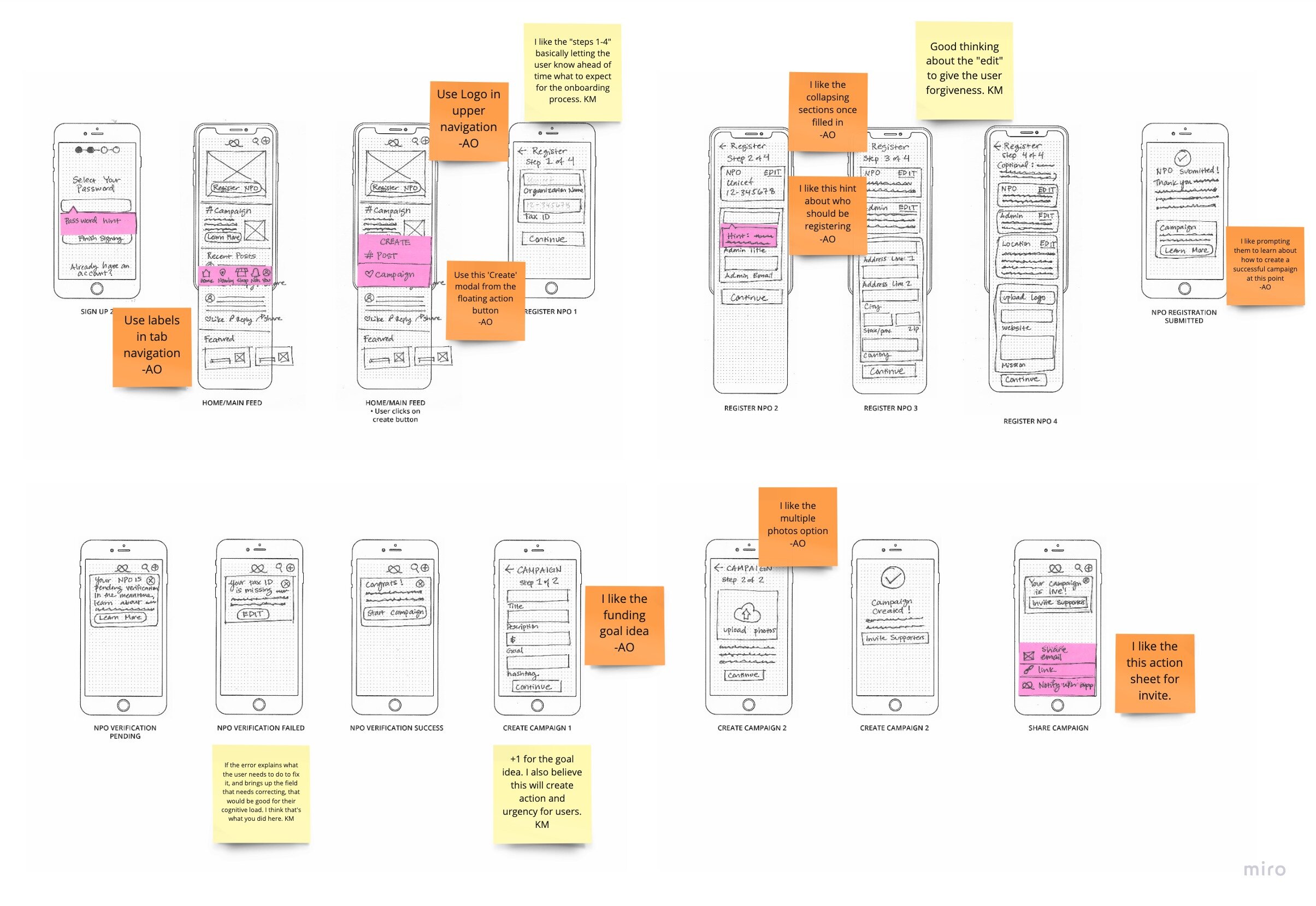
brainstorming & sketching
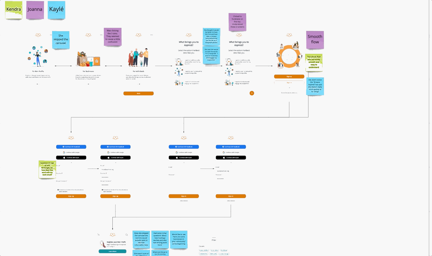
First, we brainstormed and sketched individually for how the user flow could look. Next, we discussed the strengths of each of our solutions and brought them together into one coherent user flow that would form the basis of our medium-fidelity wireframes. One great advantage of working as a team was the ability to focus on disparate elements of the flow individually. Here I show just my sketches with my teammates feedback; however, Kayvan and Abi will share own set of sketches in their portfolios.
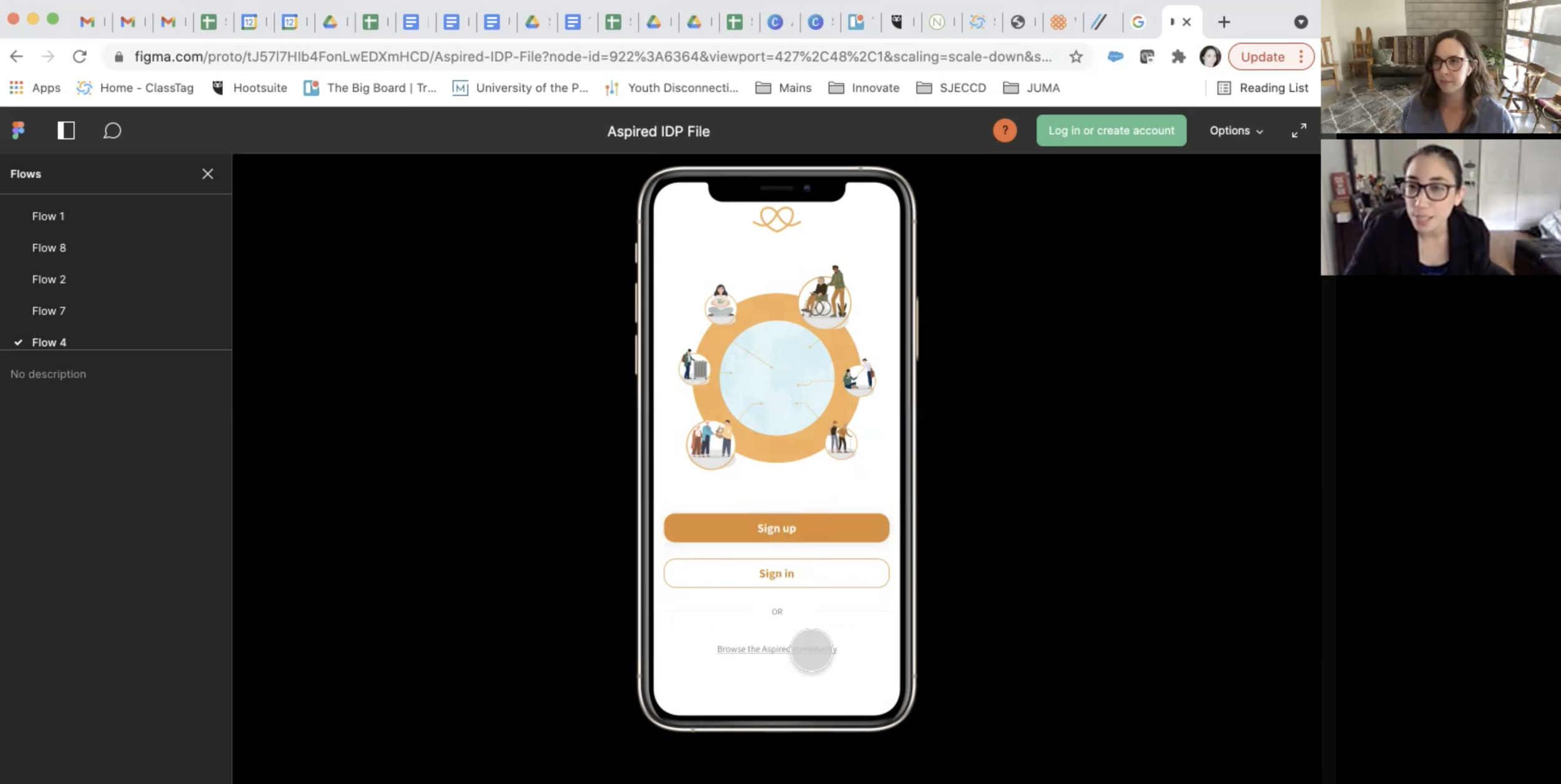
Medium Fidelity Wireframes
Using design elements from Aspired’s current user-interface, we created a medium-fidelity clickable prototype in Figma that we tested with real non-profit admins for their feedback. We recruited participants from our own networks and backgrounds. Our intention was to test real copy and the logic of our user flows with target users without the distractions of color and illustrations.


Usability Testing Round 1
We conducted two rounds of usability tests and recruited 6 individuals who worked in nonprofits at an administrative or leadership level with extensive fundraising experience. We prepared three task-based scenarios for the testing participants to complete. We captured each individuals’ reactions and found areas for further refinement that we would address in our high-fidelity designs.
What went well
Sign up was simplified and smooth
Other than a few tweaks, non-profit registration met expectations and was straightforward
Choosing a hashtag for the campaign was not a surprise / didn’t present an obstacle
What could be improved
More education needed on the benefits of registering your non-profit
More hand-holding and support on inviting donor base and followers to engage with a campaign
Take into account mental models and expectations
high fidelity wireframes
Aspired is growing and as it grows, the need for a comprehensive design system will become more and more important. Since no pre-existing system existed, we made this lightweight version. Especially since multiple designers and Springboard teams are going to be coming on and off the project, it’s going to be crucial to have this as a reference to keep all the screens consistent and maintain brand integrity.
We also did a lightweight accessibility audit and added accessible versions of the orange and the teal. These darker versions will help Aspired meet the AA standard for web accessibility.

At this stage we did the following:
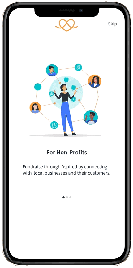
Simplified the carousel for the three target user groups
Added a step for the users to self-identify their main purpose for being on the app in order to show them a home screen where the CTA is personalized to them
Simplified sign up: easy tweaks, move up social shortcuts in the process, add a password hint and don’t force users to open the mail app
NPO registration flow consistently tested well, but recommended to automate this as budget allows
Created a campaign flow also tested well, but more education and support is needed for after the campaign is created
Users Self Identify

Sign Up Flow
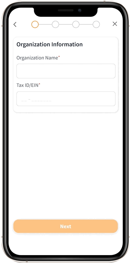
Nonprofit Registration
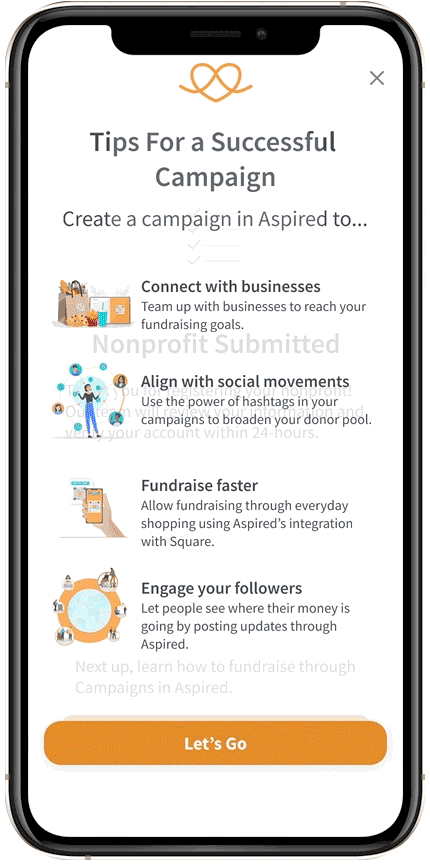
Create First Campaign
usability testing round 2
Here are the high-level findings from the second round of usability tests:
Easy to resolve
Adding a word limit to the campaign description
Ability to add new causes
What still needs to be resolved
Ability to add local chapter locations for international or country-wide organizations
The user experience of transiting from creating the campaign to engagement still needs improvement
Ability to track the campaign
Campaign Created
Needs to be tested and explored further
Recommendations & hand off
On Monday August 16, my team and I handed off all artifacts (Miro board and Figma prototype) to the Aspired team. These were our recommendations on next steps and continued improvements:
Conduct user research for the business and individual supporter user types to understand how to effectively onboard these users.
With the findings from the user research for business and individuals, create a tailored onboarding flow for these users.
Once the needs and perspectives of the business and individual supporter user types are understood, consider redesigning the “Invite Businesses/Invite Followers” portion of Aspired’s Campaign flow to incorporate those perspectives.
Keep WCAG Accessibility in mind. With multiple designers, a design library will be essential for maintaining brand integrity and consistency
Watch out for vague copy and competing calls to action. Become familiar with the Basic Laws of UX
Keep in mind the user’s cognitive load and try not to overwhelm them
Learnings
"I had incredible experience working with Frances and her team together on Aspired app in reimagining nonprofit experience. Frances delivered quality work in a timely manner and dived right into our new project without hesitation. She is an amazing collaborator, and a skilled designer who can quickly identify the problems users face and solve them elegantly." - Hien Nguyen, CEO
My experience with Aspired deepened my understanding of how to balance the goals of a business with the needs of the user. We wanted to support all that Aspired is trying to achieve with a complex set of user types: individuals, nonprofits and businesses. At the same time, we did not want to overwhelm the user or burden them with too many competing calls to action. A great solution was having the user self-identify their main purpose of joining the app before they even sign in. That way, they see a home screen that is catered to their needs.
I really enjoyed working on a fleshed out team of UX/UI designers. It allowed us to accomplish a great deal in a relatively short amount of time. We each focused on solving different problem areas: the onboarding, the nonprofit registration flow, the campaign creation flow, campaign dashboard, and ongoing campaign engagement.
