design sprint
House 2 Home is a new startup that wants to help people decorate their new homes and apartments.
House 2 Home is a fictional e-commerce company that sells home decor items and accessories. Through surveys, they found that many of their customers have just moved into a new home or apartment. Their users want to buy multiple items to personalize their new place, but don’t feel confident doing it on their own and are shopping on restricted budgets.
I completed this GV style Design Sprint solo over the course of 5 days. Bitesize UX and Springboard partnered to provide us with a series of design briefs and because I am an interior design enthusiast, I chose House 2 Home.
Design Constraints:
Solution needed to be a website designed for larger screens (desktop or laptop)
Focus on helping users who want a starter kit of multiple items
Products are priced within the $10 - $50 range

My Role: Map, Sketch, Decide, Prototype, Test
Tools Used: Miro, Figma, Google Suite, Adobe Suite, Zoom
Day One: MAP
On day one I familiarized myself with the problem, read through some research, and mapped out the product’s most important user flow. The stakeholder provided research in the form of interview highlights, a barebones user persona and a recorded interview. I organized all the pain points collected from the interviews in the form of post-its.

I fleshed out the user persona provided by Bitesize UX to use as my guidepost throughout the design sprint.

With all the research and user pain points floating in the back of my mind, I drew a possible end-to-end experience in the form of a user journey map.

day two: sketch
On day two I conducted lightning demos and sketched ideas as a way to generate possible solutions. For the lightning demo, I looked at what competitors have produced to solve a problem similar to House 2 Home. I also looked at products that solve a similar problem, but focus on a different area of engagement.
Ikea Home Planner
The Ikea Home Planner allows users to create a mockup of a room and choose from many settings: room shape and size, windows, wall color, flooring, etc. You can then place Ikea products in the room to visualize how it could look.


Modsy
The Modsy website offers an entertaining quiz to help customers determine their interior design style, an educational design blog, and design ideas and examples. They seem to address a similar customer pain point to House 2 Home, but with the additional price tag of paying an interior designer to make a rendering with recommendations for a space. I didn’t explore further after reaching the paywall.

E-Shakti
E-Shakti is not a home decor company. They are in the business of women’s fashion; however, the website does a really great job of offering visual customizations for each individual client. Shoppers can choose their own necklines, sleeve length and style, hemlines, etc., as well as input their unique measurements for bust, waist, hips, height, and more. The garments are cut and sewed and made to order, giving customers a high level of confidence that they will receive something that fits well and looks right for them.

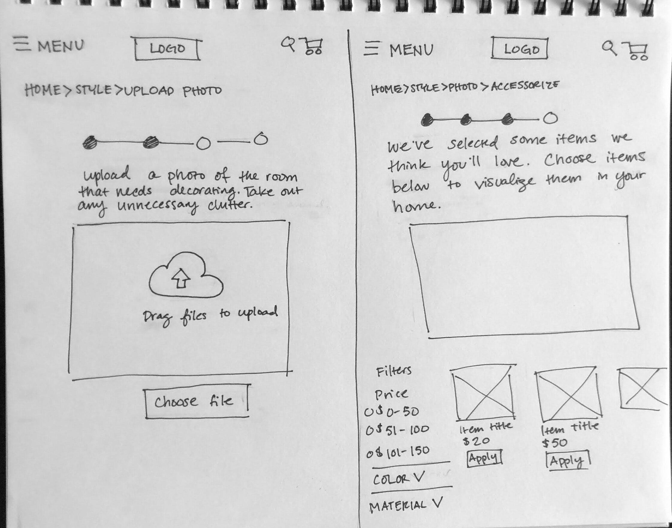
After the lightning demo was done, I used a technique called Crazy 8’s to help come up with possible solutions. I felt that the crux of Ally’s pain points revolved around the inability to visualize items in their space. From the quotes and insights that were shared with us, there was a lack of confidence among shoppers, from not measuring things ahead of time to not knowing what items go together and could achieve a specific style. Thus, for the crazy 8’s I focused on possibilities for a room visualizer tool.

After I sketched my ideas, I created a storyboard for one of my potential solutions. At this point, I decided to eliminate the step of “choosing a budget.” My mentor suggested that the client (House 2 Home) would have a goal of selling items that might be slightly above the user’s budget constraints. I prioritized the price filter on the room visualizer page so that users could see a range of items and might consider products at a slightly higher price point.

day three: decide
In a normal design sprint, I would have used day three to pitch my idea to the rest of my team and then work together to pick the solution we like best. However, because I was working through this sprint solo, I used day three to flesh out my storyboard. I felt that what Ally struggled with the most was visualizing potential products in her space; therefore, I spent most of my effort on a tool to help her envision her specific home with items from House 2 Home. I took a risk and decided to focus on letting the user choose items individually, before pitching a “package” or “kit” of items. Feeling overwhelmed was a common theme among the users and I had a hunch it would be better for them to apply and remove items one by one rather than getting inundated with a bunch of products at once.


day four: prototype
After 4 years of using Adobe XD to wireframe and prototype, I gave myself an additional complication of learning Figma and building the wireframes and prototype in a single day. I would not recommend learning a new design tool during a design sprint and will try to avoid that in the future; however, I do not regret learning a new tool. For the sprint, I focused on the most essential screens to build a realistic facade; just something I could put in front of customers to gauge their reactions about my room visualizer idea.


Because one of the design constraints was to focus on desktop, I mainly thought about hover interactions for the user. I spent most of my energy on making the room visualizer playful and engaging. For the purposes of this design sprint, we have to assume some artificial intelligence is at play that has the ability to place items proportionally within the room. I thought it would help users to see the dimensions of the products so they are not unpleasantly surprised if something is too small or too large.
day five: testing
I conducted 5 remote usability tests over zoom, using the five act interview technique from Google Ventures. From the one and only round of user testing I learned:
Overall, everything about the website made sense and seemed familiar. Users liked the breadcrumbs, as well as the 4-step progress graphic at the top.
One user recommended giving some hint of the 4-step process on the home page, rather than seeing it for the first time once you navigate away from home.
Users wanted to know more about the type of technology that could estimate dimensions and show items proportionally within the room.
Users really enjoyed using the room visualizer and wanted the website to make suggestions for more items based on items they had already chosen.
One user wanted the ability to create a wishlist for items that she could not immediately afford.
Lessons Learned
Here are some things I learned from doing the design sprint.
This design sprint felt more like a design crawl. Maybe I just don’t like working in complete isolation during a design sprint. I really missed being part of team where we could share ideas and divide and conquer.
Don’t try to learn a new wireframing and prototyping tool during a design sprint. I am happy I learned Figma, but a design sprint is not the time or the place to take that on.
There is an opportunity for more home decor companies to incorporate some type of room visualizer feature within their digital solutions. Ikea’s Room Planner is great, but can only be used with Ikea products.
What’s Next for house 2 home?
Since this was a design sprint, there is still a lot to do to make House 2 Home a fully functional website. Some next steps could be:
Build out the style quiz feature. During testing many users commented that they would normally start there because style quizzes are entertaining.
Design for edge cases, such as what if a user uploads an unusable photo of a room? What if a user adds too many products to the room visualizer?
Build out a user profile section with items that are bookmarked for future purchases, style preferences, etc.
After making more iterations to the prototype, more testing of course!
Finally, if I had to define my own interior design style it would be somewhere between Bohemian and Eclectic. If you want to learn more about the Bohemian way of decorating and curating spaces, I highly recommend Justina Blakeney’s book, The New Bohemians.