nuestra casa
Zero waste e-commerce
Project Background:
Nuestra Casa sells climate neutral, organic, and eco-friendly skincare and home goods in plastic-free packaging. They need to enhance their browsing and checkout experience to improve usability. Their goal is to improve the conversion from browse to completion of checkout to increase revenue on the product’s mobile-web experience.
The Problem
50% of Nuestra Casa users open 7 item pages on average and then abandon the site. The project manager’s hypothesis is that users are unable to determine which product is best based on relative features.
Additionally, 70% of users who place an item in the cart do not make a purchase. Data shows that users abandon the cart at the registration page. Right now, users must create an account to purchase. The project manager wants a guest checkout to solve for this. The guest checkout must capture email.
My Role
UX Research
Design Strategy
Branding and Identity
Usability Testing
Wireframing + Prototyping
Tools Used:
Miro
Sketch
Invision
Adobe XD
Google Suite
Adobe Illustrator
Zoom
Phase One: Discover
Research questions:
What causes friction in the buying process?
What fears or doubts do our customers have and how can we resolve them before they buy or bounce?
What words do our customers use to describe our products?
Is the website navigation intuitive?
What do our best customers have in common?
What products do our customers frequently buy together?
After conducting a series of 30-minute user interviews, here are some of the pain points that emerged:
Consumers are skeptical of eco-friendly branding
Need for transparency and details on what a company is doing to achieve sustainability
Shopping on Amazon is practically unavoidable, yet many consumers felt guilty about using it
Hesitant to buy something unfamiliar and new, but reading reviews helps
“I do tend to put a lot of things in my cart just for comparison, even though there are other ways to compare things. It’s just faster that way.” - Kim (Interview Participant)
“I like companies that are transparent, charitable, and ethical. I appreciate when companies make an effort to become a B corp.” - Carol (Interview Participant)
“When I order from Amazon, I worry about where things are made.” and “I am cautious about inauthentic ‘wellness’ products. It’s not really ‘wellness’ even if it claims to be.” - Karen (Interview Participant)
“You have to go out of your way to find out what is ethical about products or brands.” - Jason (Interview Participant)
After synthesizing the interviews, here is the empathy map I came up with to guide the project:

Phase Two: Define
The next step was to define the user persona. Kristen is a fusion of characteristics and qualities collected from interviews with target users.

With the user personas in mind, I began to articulate the problem by defining the HMW questions.
How might we help consumers fairly compare products within a mobile e-commerce experience?
How might we make the guest checkout experience effortless and rewarding?
How might we create transparency about a product’s climate footprint?
How might we reduce a customer’s mental load and anxiety when trying a new product?
The HMW questions guided the user journey. In order to focus on the overall user experience, rather than design details, I decided to create a user flow. If I was working on a team, the user flow would be an essential document to communicate and collaborate with non-designers. This user flow is the visual representation of the different journeys a customer can take from the home screen, to shopping, to comparing products, to checkout.

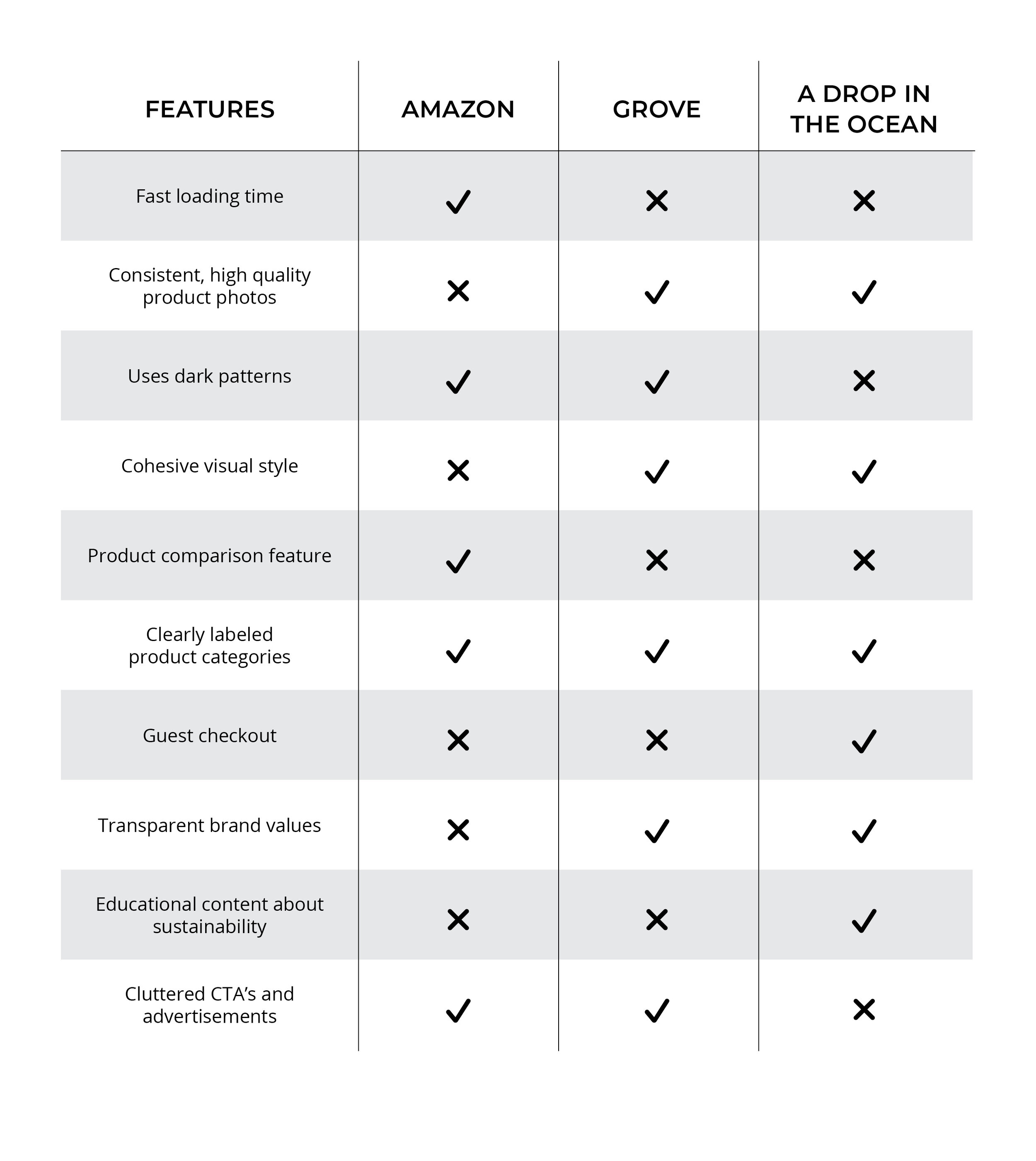
Competitor Analysis
In order to better understand the landscape of solutions for e-commerce apps, I did a competitive analysis as part of my UX research. This exercise provided strategic insights into the features, functions, and flows of Nuestra Casa’s competitors. While no exact competitor exists for the problem space I was working in, Amazon, Grove and A Drop in The Ocean came closest.
Defining the Brand
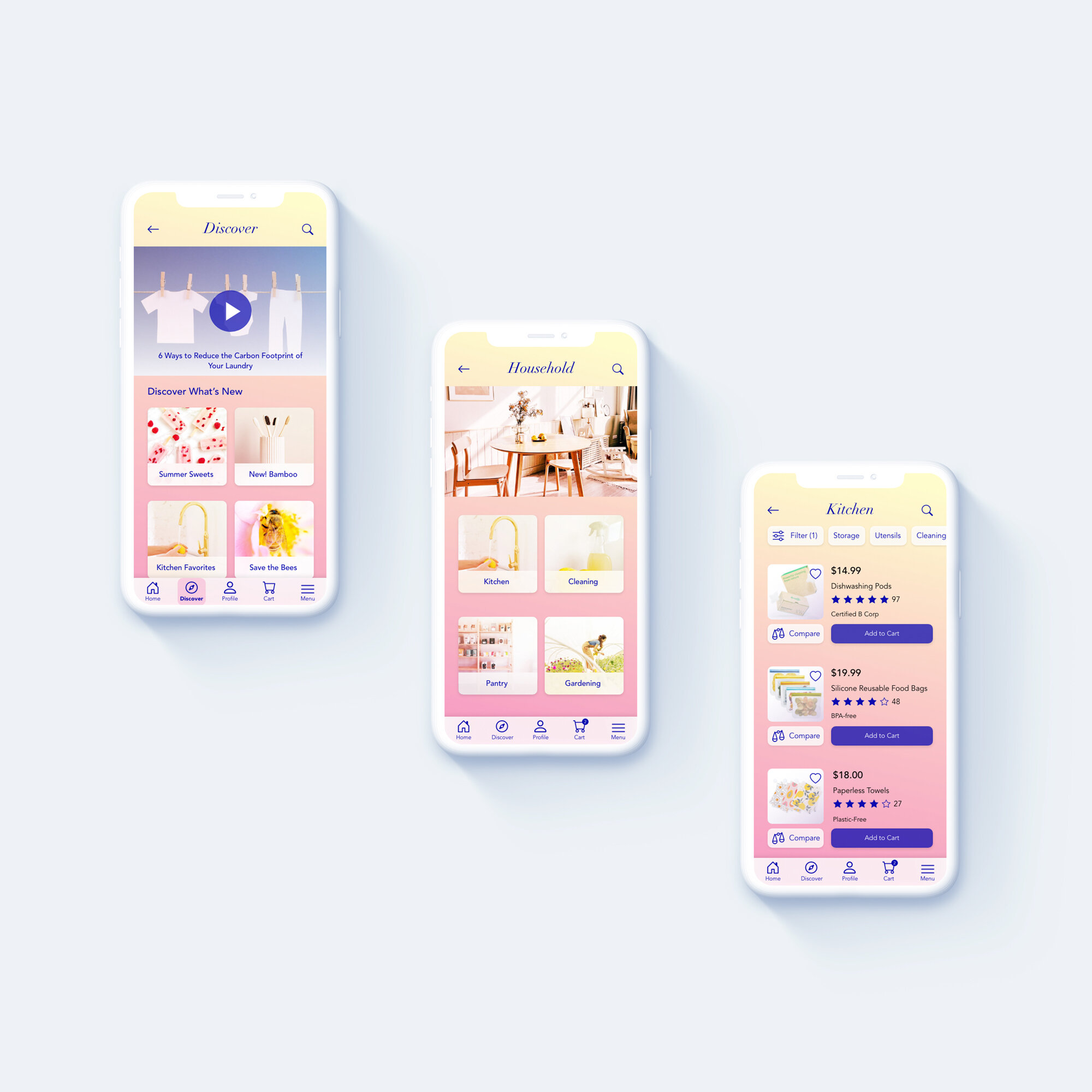
For Nuestra Casa, I wanted to create an e-commerce app that is enjoyable to use. I wanted it to have a bright, uplifting, ethical and honest personality. I communicated the brand values through the use of luminous gradients, a contrasting bold blue, botanical illustrations, bright photography, and glassmorphism.

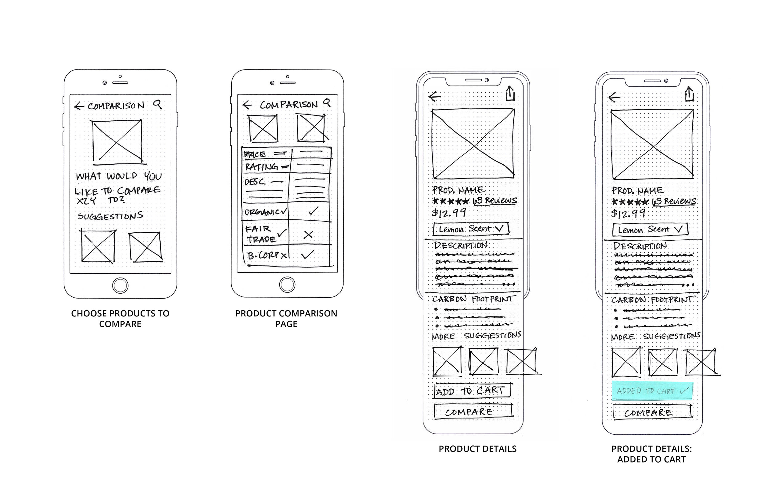
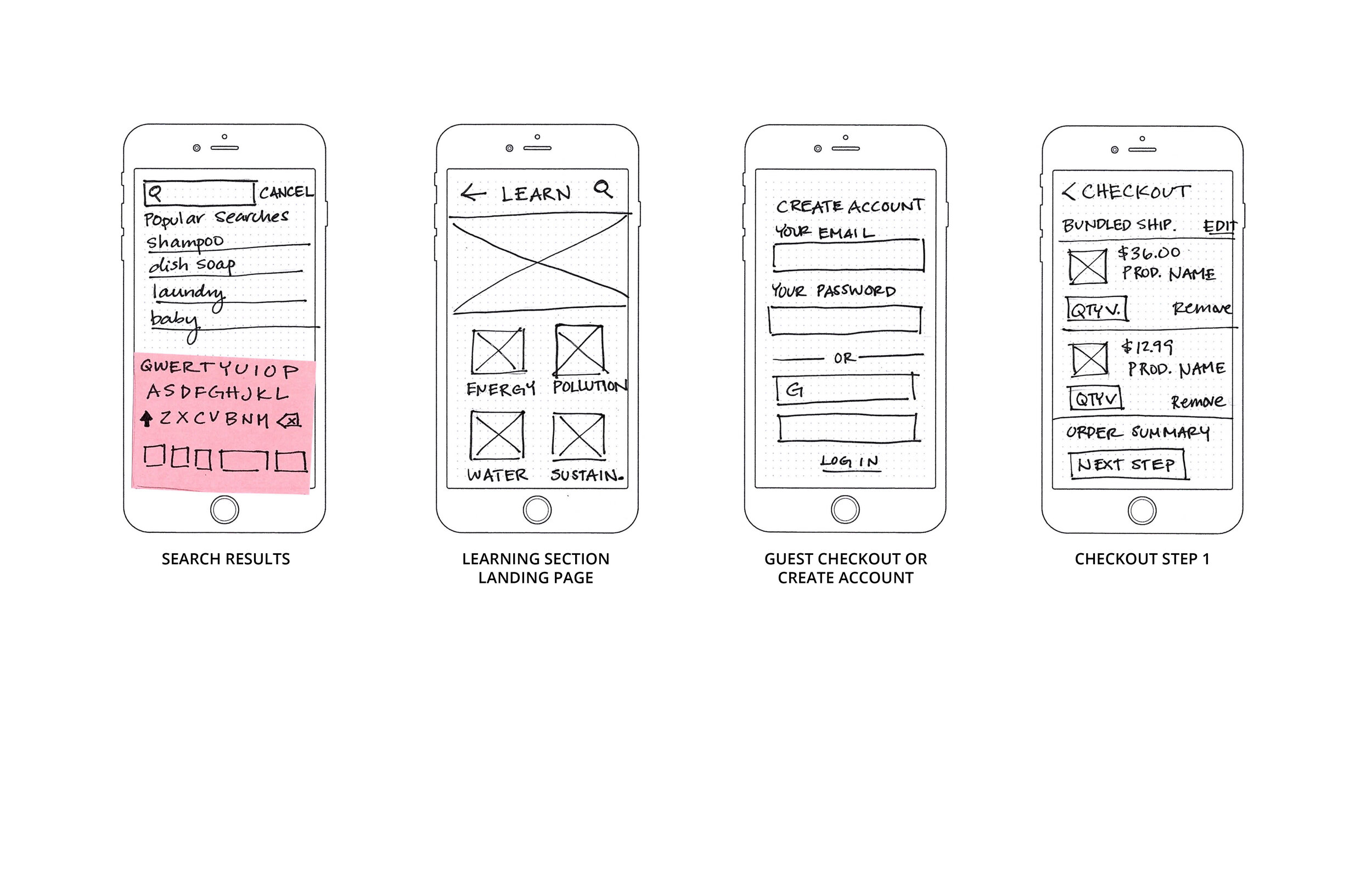
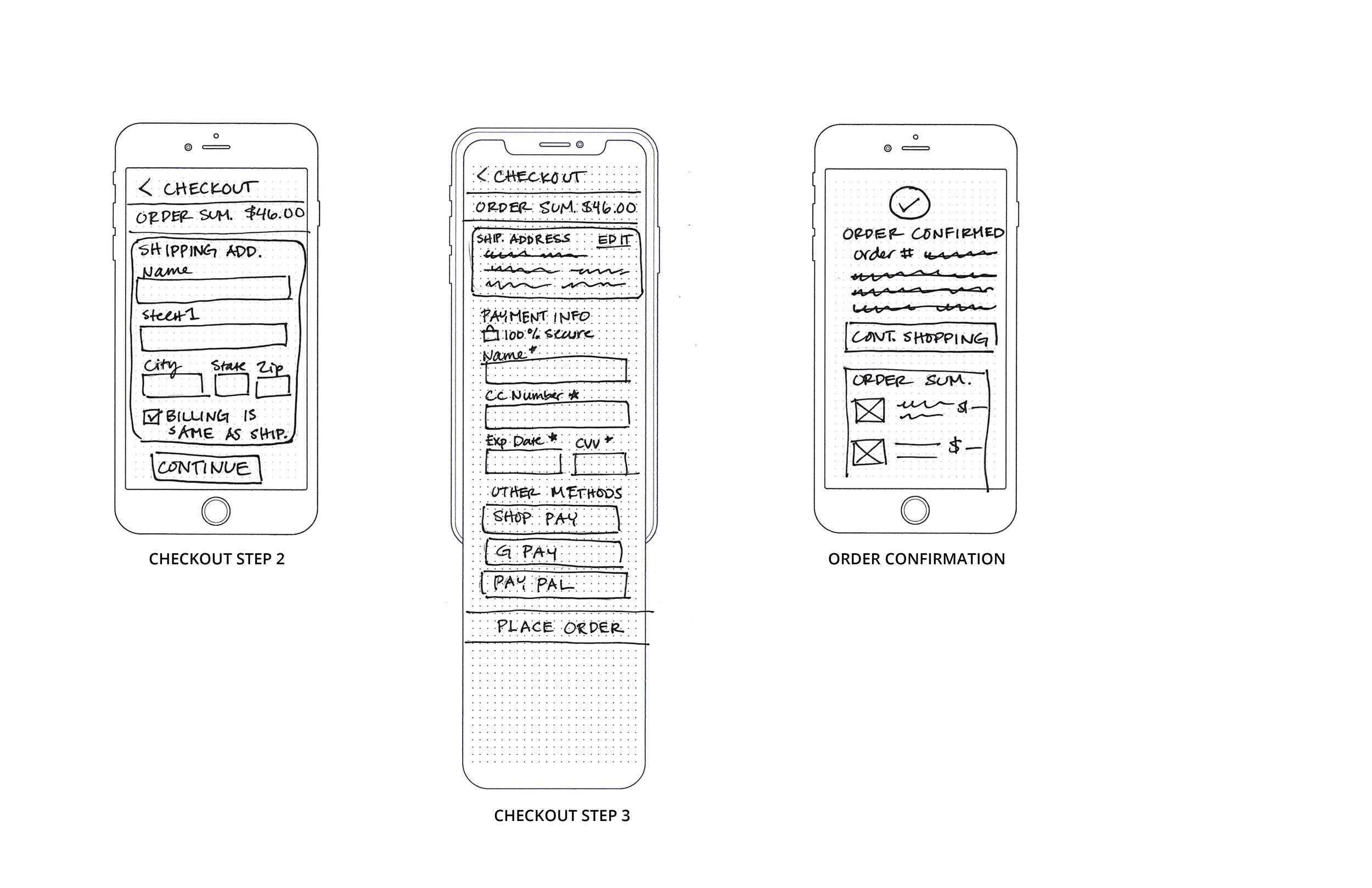
Phase Three: ideate
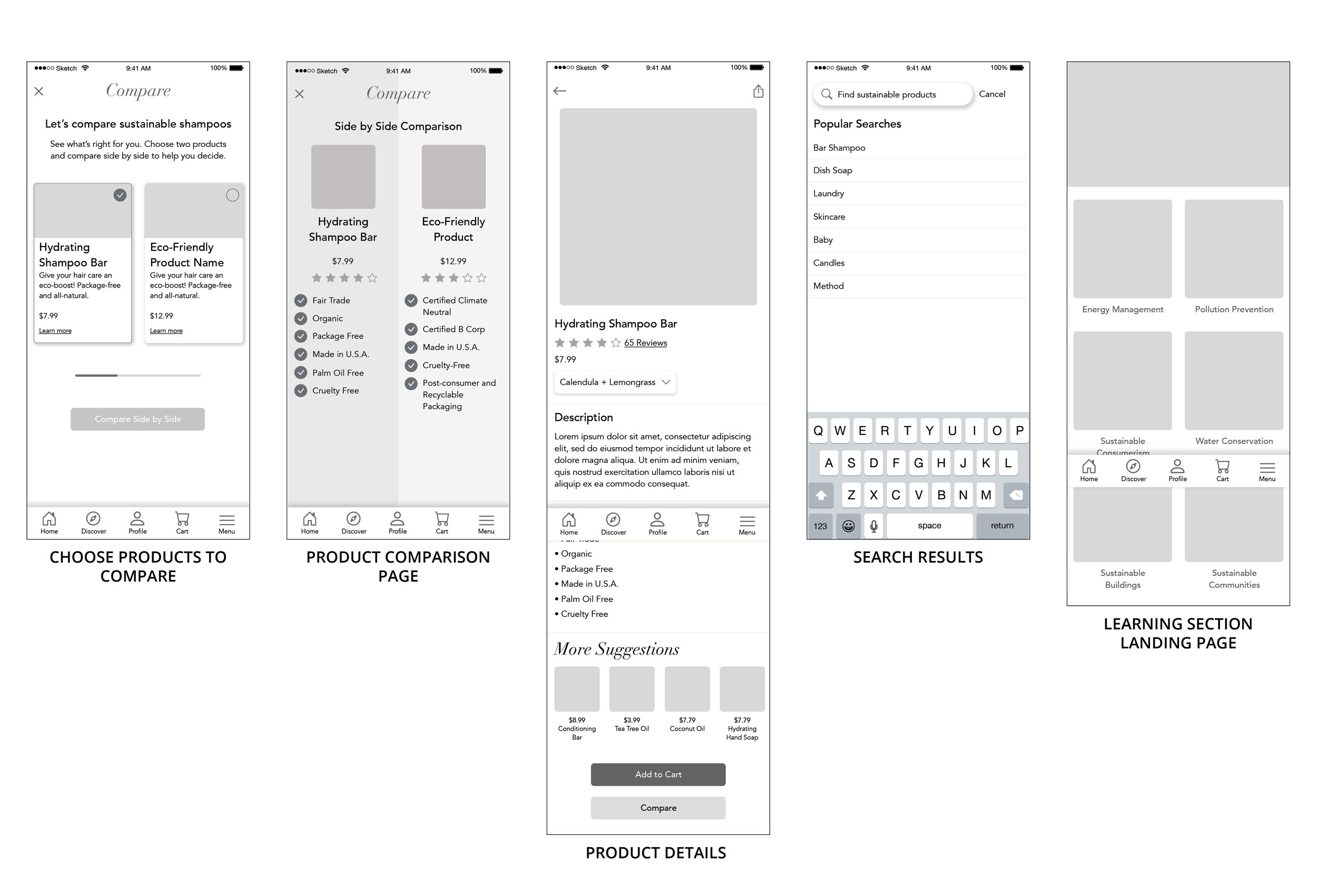
After sketching my thoughts out by hand, I created the low fidelity wireframes in Sketch and uploaded the screens to InVision for prototyping. While a lot of e-commerce is standard these days (well placed search bars, minimal navigation, clear titles and categories, and consistent checkout), not many e-commerce apps have a dedicated, easy-to-use product comparison feature. I used this phase of the project to map out how the product comparison feature could work, where content would be placed, and how the checkout sequence would flow.
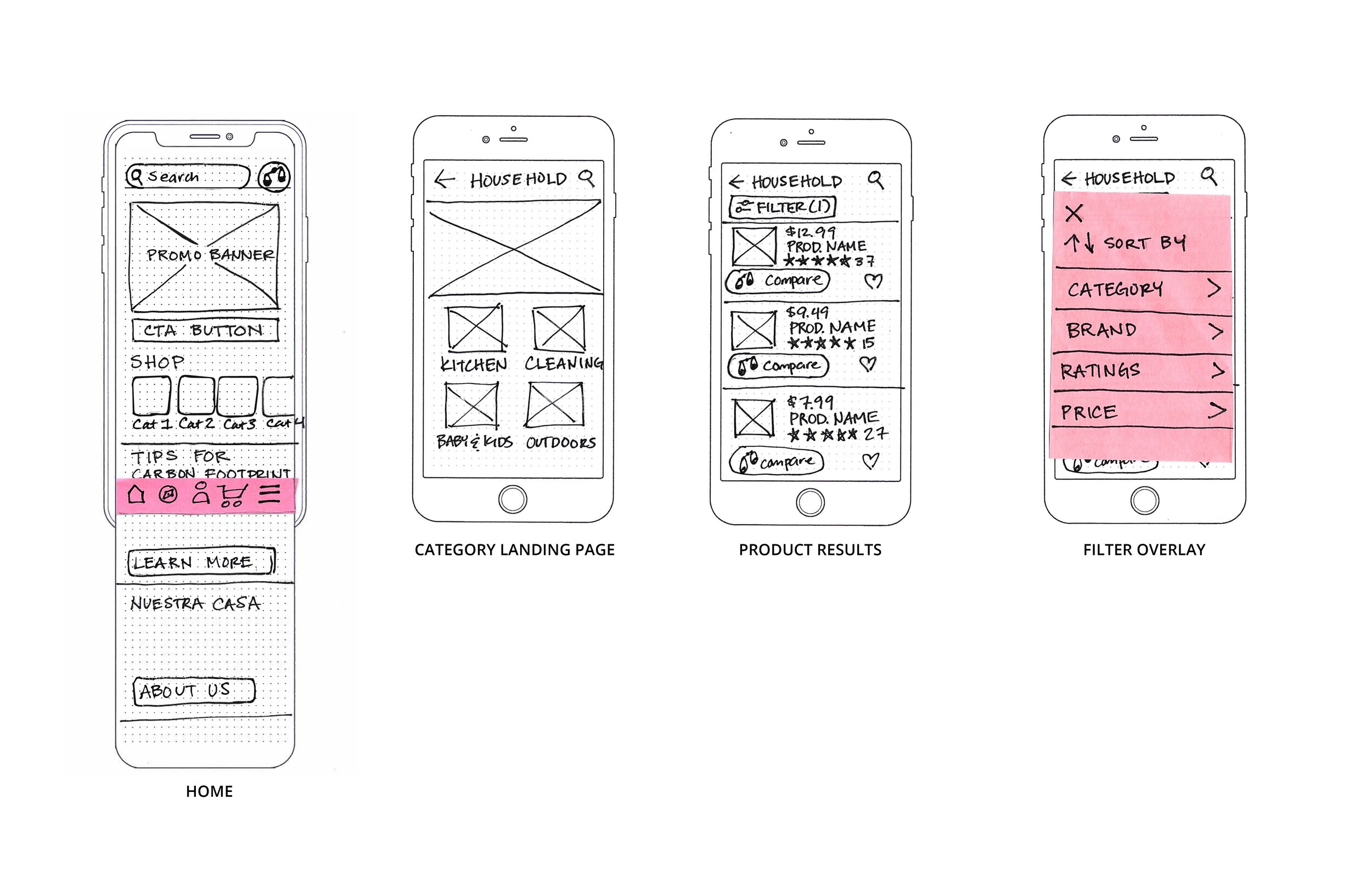
Since I had to introduce a non-standard icon for comparison, I also did a survey of potential users to gain insight into what icons could be used for “compare.” Over 90% of participants associated the scale icon with a feature to compare products.
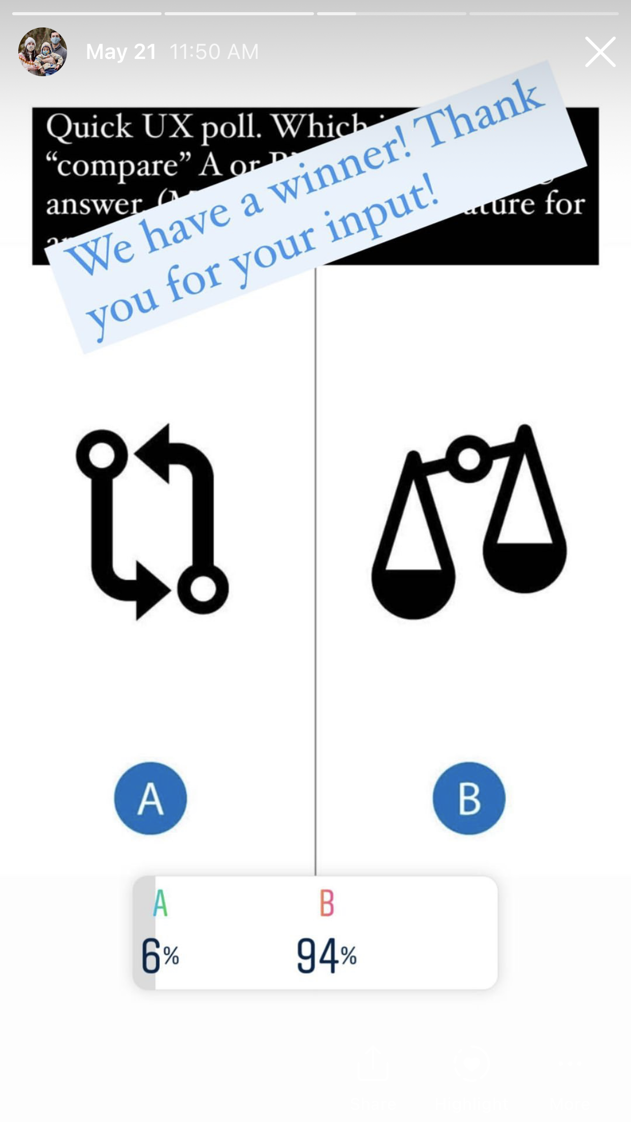
Survey was conducted on Instagram and Slack
phase four: prototype
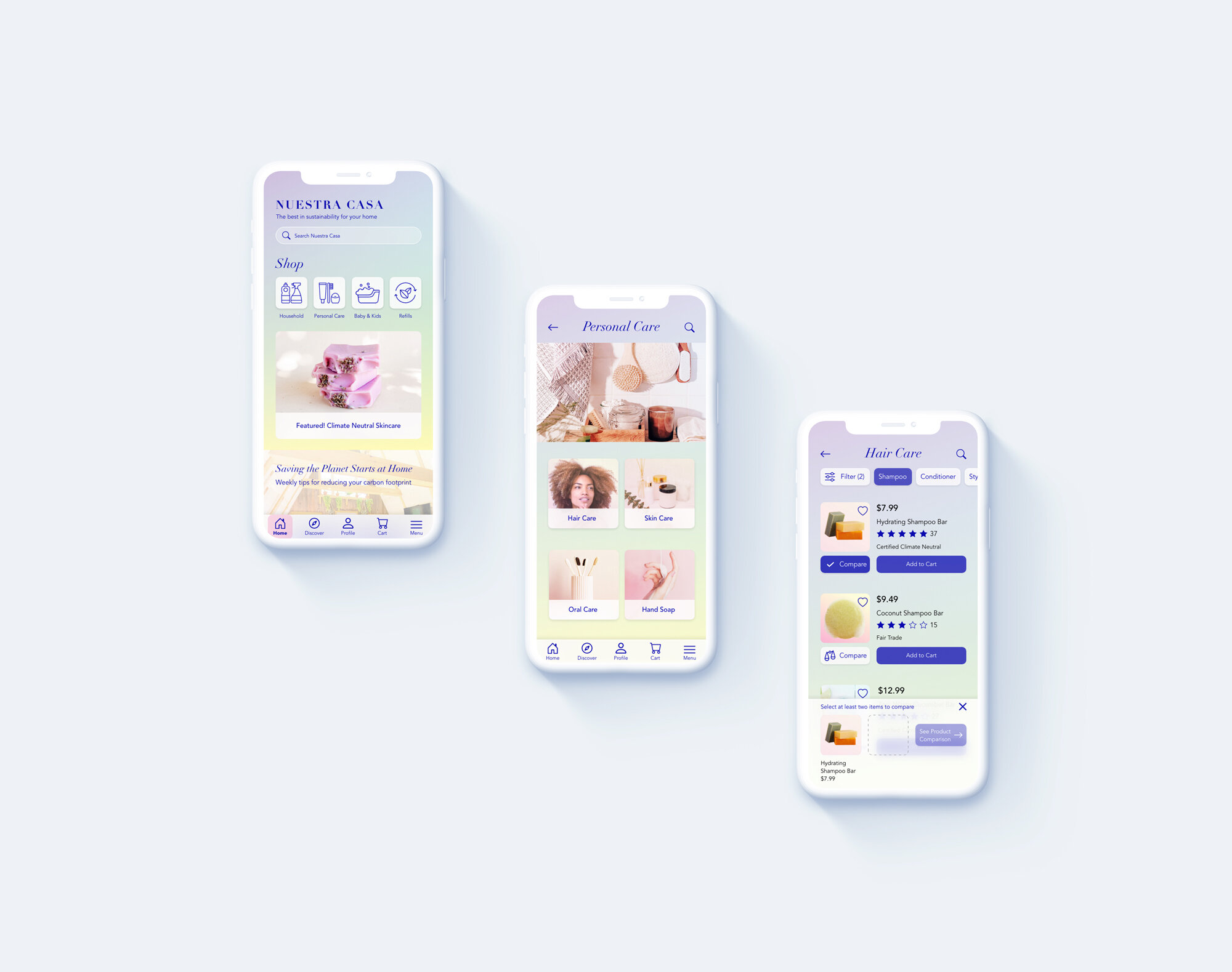
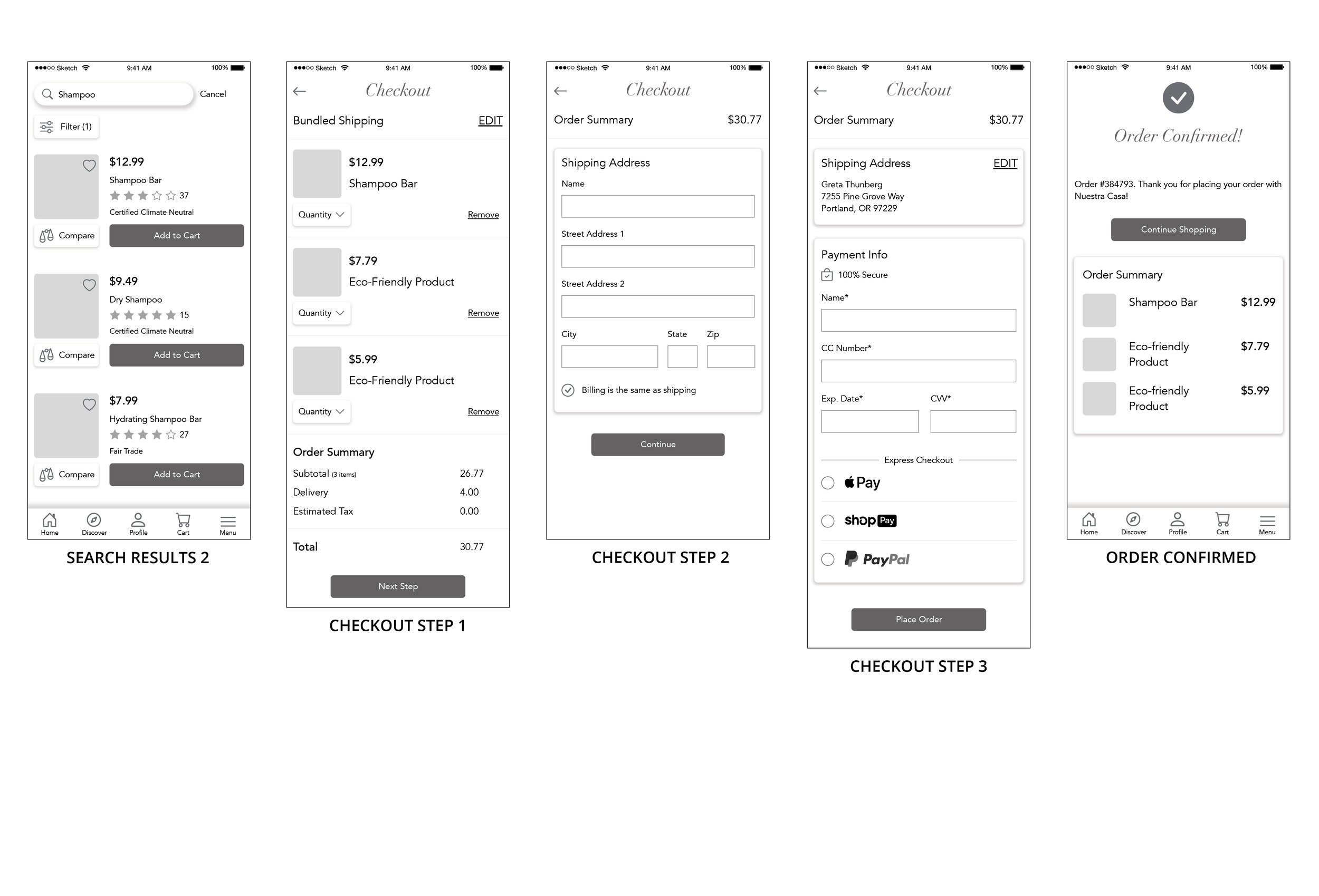
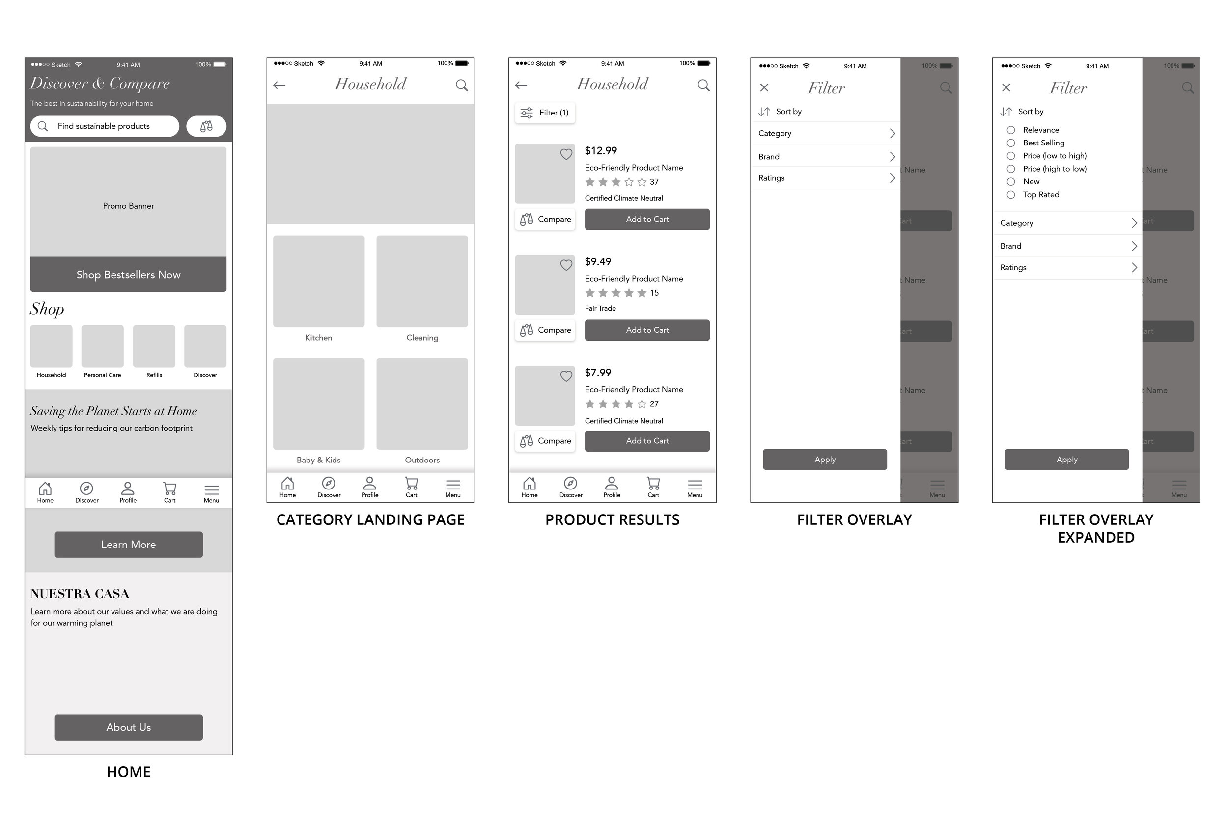
At this stage, I continued to work in Sketch for the high-fidelity wireframes, but switched from Invision to Adobe XD to achieve the animations I wanted to create. Based on user testing, I removed the compare button from the home page, simplified the comparison feature to two-products, increase routes to the product details page, and improved the guest checkout sequence.
I chose different gradients for different sections of the app and experimented with glassmorphism, which I thought paired well with Nuestra Casa’s goal of transparency. I sourced photography from Pexels and Unsplash, but applied my own adjustments and overlays to the photos to create a cohesive looking collection. The typography is understated, yet refined.
Loading Animation

Guest Checkout

Product Comparison Sequence

Order Confirmation


phase five: test
Round 1
Round 1 of testing was completed in May 2021 with a medium fidelity prototype. The main takeaways were:
Users were not sure what the compare “balance” icon was all about on the home screen, but when placed in context on the product list page, they immediately knew what it was for.
Users wanted a way to just compare two items rather than having to select all three. Most participants felt that it would be simpler to compare two items at a time and not have content going off the screen.
One user wanted a link to the product page from the comparison page because she wanted to see more information before deciding to purchase.
Some users knew what “Bundled Shipping” was, but others were not sure what it meant.
Round 2
Once the hi-fi prototype was complete, it was time to test again. I executed a second round of moderated usability tests. From testing, I made the following changes:
I gave the user more control by adding click to go to home screen after loading animation.
I changed “Discover & Compare” header to “Nuestra Casa” because it was confusing and some users from the first round thought it should say the name of the company at the top of the screen.
I moved “Shop” and shopping category icons higher up in the hierarchy and put the “Featured” CTA lower down in the hierarchy.
I changed the task/navigation bar. Previously, icons had a drop shadow and bolder text, but some users still couldn’t differentiate between an active and inactive tab. I added a color rounded rectangle to the active tab.
I added “shortcuts” next to filter button on the product results page, to reduce the number of steps a user would have to take to filter products.
On the product comparison page, I took the “X’s” and checkmarks outside of a blue circle so the shapes would be easier to differentiate as a user is scanning a the page.
Reflections and Learnings
Lessons Learned
Eco-conscious consumers are wary of brands touting sustainability and are willing to do their own research to ensure they are supporting brands that practice what they preach
Although these eco-warriors enjoy shopping sustainably, it can also be an inconvenient burden
Many aspects of e-commerce UX/UI design are highly standardized, but there are very few effective design solutions for product comparison
The product comparison feature was a complex problem to tackle, but users commented that the ultimate solution was well thought out, easy to scan, and that they liked having control of what to compare as opposed to choosing from pre-selected options
I had a lot of fun designing the checkout sequence and I like how this solution gives users a little recap of each step of the process so they can easily scan for possible errors
Next Steps
Hand off prototypes to developer
Build out the sign up process for users that want to create accounts
Build out wireframes for desktop and tablet. Wider screens will allow for more products to be compared side by side
Continue with testing and iteration
Measure success metrics, such as impressions, reach, abandonment, engagement and organic acquisition traffic