Parenting in our 21st century environment is no picnic. And parents deserve better.
Dads are parents too, yet 90% men’s restrooms don’t have changing tables. Breastfeeding is a human right, yet there are regular reports of mothers and babies being asked to cover up or go elsewhere. Today’s parents share a frustration at the insufficiency and lack of family facilities in the public sphere and we, as a society, need to talk about it more.
Picnic is a mobile app to connect parents to businesses, places and brands that have all the services and features that they need. Parents with small children deserve to enjoy family outings and being in the public sphere. At the same time, businesses need to start considering the needs of this underserved, yet important consumer group. Oftentimes, the best sounding board and word-of-mouth recommendations come from other parents, so I also explored a social feature.
My Role: UX Research, Design Strategy, Branding and Identity, Usability Testing, Prototyping
Tools Used: Miro, Marvel, Adobe XD, Google Suite, Adobe Illustrator, Zoom
Methodologies: 1) Discover: Empathize; 2) Design: Define + Ideate; 3) Validate: Prototype + Test; 4) Divergent and Convergent Thinking
Empathizing: Early Insights
Conducting Secondary Research about parenting struggles was not a straightforward process. The thing about parenting struggles is, they are often invisible, difficult to quantify, and there are not exactly a ton of scholarly articles about this topic. I looked at it from the angles of changing tables and “mom-shaming” in the context of breastfeeding. My research revealed that a movement had been initiated in 2019 to get more changing tables in men’s restrooms. A dad named Donte Palmer went viral for this photo of him trying to change his son’s diaper without a changing table. Subsequently, Pampers conducted a survey which revealed that 90% of men’s public restrooms do not have baby changing tables. Three years later, and not much has changed. I spoke with many fathers that have a negative outlook or just automatically assume there won’t be changing tables in the men’s room.
While dads face the logistical challenge of not having access to changing tables, moms face even greater obstacles when it comes to breastfeeding in public and “mom-shaming”. There are regular reports of mothers being asked to cover up or go somewhere else while breastfeeding in public. One of the moms I interviewed made a point to go shopping at Nordstrom, a store that is well known for its comfortable, safe family rooms. Other parents mentioned the local zoo being a favorite spot because they could rely on it to have stroller access, nursing rooms and changing tables.
As parents, we have a shared frustration at the insufficiency and lack of facilities in restaurants, airports, hotels, and we need to talk about it more.
the mental load of being a parent
After doing some desk research, I was ready to conduct Primary Research. I surveyed 32 parents to learn more about their habits when it comes to tracking amenities for families when they are out in public. I discovered that parents are privately keeping detailed mental notes about which places have what particular amenities that make their lives a little bit easier, such as changing tables, nursing rooms, high chairs, and more. What if we could take away that mental load and have something else keep track for them?
Parent Survey Results
After the survey I interviewed seven parents to better understand their pain points, needs and goals. The user interviews provided powerful insights. One mom said she never felt like she could go anywhere unless she had true privacy to pump. A father said whenever he goes anywhere, he just assumes there will not be a changing table in the men’s bathroom. Lastly, one of the moms I spoke to, said:
“in general parenting is not easy, there are a lot of things in society that expect you to function as if you don’t have a baby or a toddler.”
synthesizing interview data
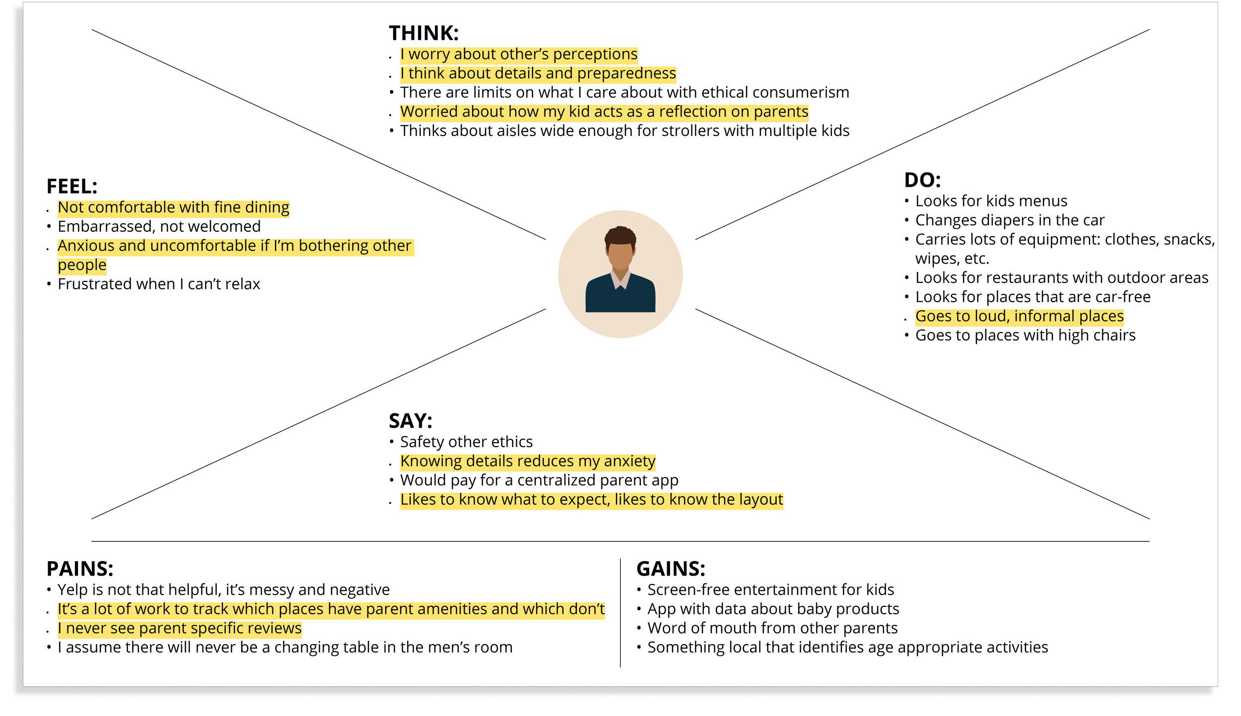
With the research phase winding down, it was time to synthesize the research and define the problem. As part of the synthesis stage, I created affinity maps and empathy maps to help organize all the thoughts collected from the interviews.

Defining Users
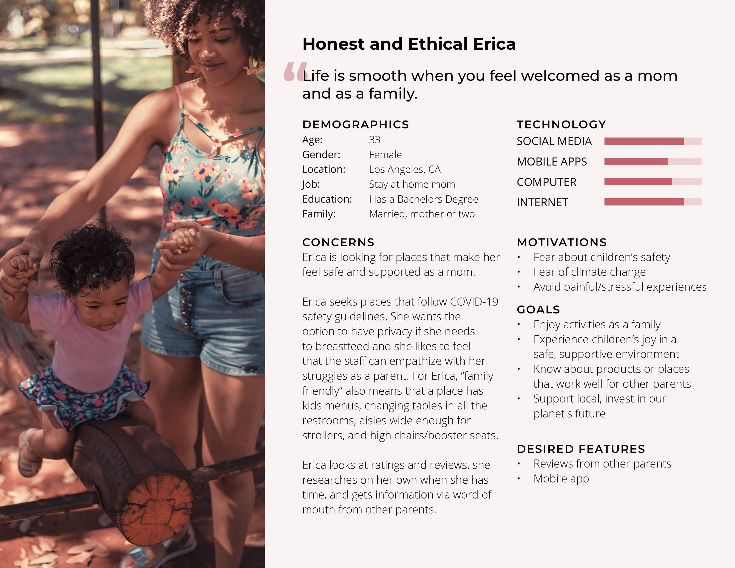
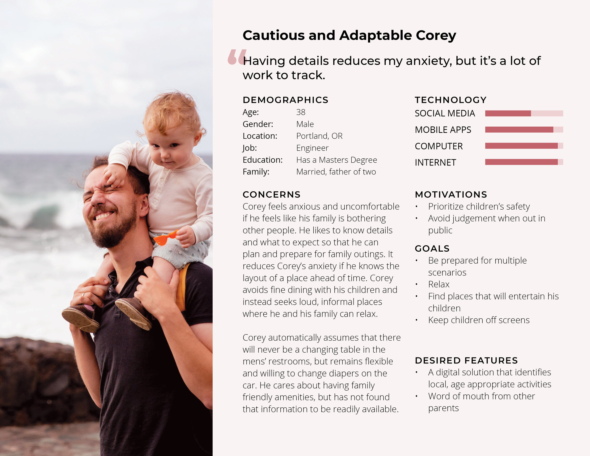
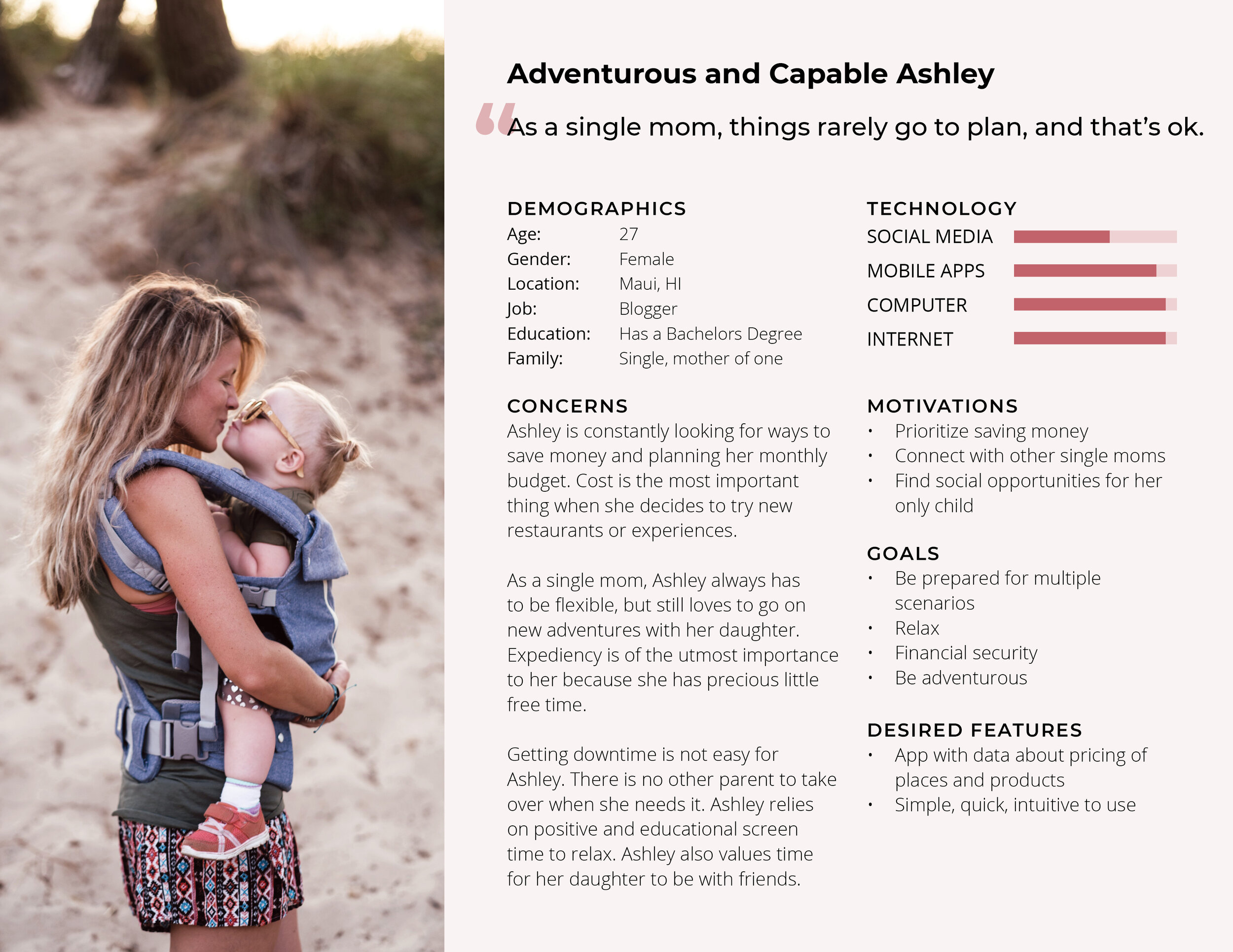
Erica, Corey and Ashley are a fusion of characteristics and qualities collected from data produced in user surveys and interviews with target users. A lot of their pain points revolved around having expedient access to details such as cost, amenities, local and age appropriate activities, and wanting access to word-of-mouth referrals from other parents.
Defining the Problem
With the user personas in mind, I began to articulate the problem by defining the right questions.
How might we make parents feel welcome and supported in public?
How might we pass information and recommendations among parents?
How might we help first-time moms feel confident breastfeeding in public?
How might we reduce parents' mental load and anxiety when trying new places?
Ideate: Mapping the User Journey
I then moved on to writing user stories to map out how users would accomplish a specific task. This is when I decided what to include and what to exclude in the product. At this point, I decided to focus on connecting parents to places, rather than products. Perhaps a feature that helped find and rate products could be included in the second round, or another app entirely. This user flow is the visual representation of the different journeys a user can take through the app.

Competitor Analysis
While no exact competitor exists for this problem space, Yelp, Winnie and Playground Buddy came closest. While Yelp is the most feature-rich app of the three, many parents I spoke to commented on how messy it was and how it lacked parent-specific information, such as details about changing tables and stroller access. Winnie solves a different, yet important, issue of helping parents find local childcare. Playground Buddy solves a very narrow and defined problem, which is to help users find playgrounds with the features they want. I evaluated these three apps based on three standards of Jakob Nielsen’s Usability Heuristics: #2 Match Between System and The Real World, #4 Consistency and Standards, and #7 Flexibility and Efficiency of Use. You can see my full heuristic evaluation here and a brief summary of features below.

visualizing picnic
I sketched out what the low-fidelity screens would look like with pencil and paper. Sketching was a very fast paced phase of the project that included a lightning round of guerilla usability tests. I focused on mobile because the product was intended for busy parents, who don’t always have time to sit at a computer and are more likely to check their phones for information.
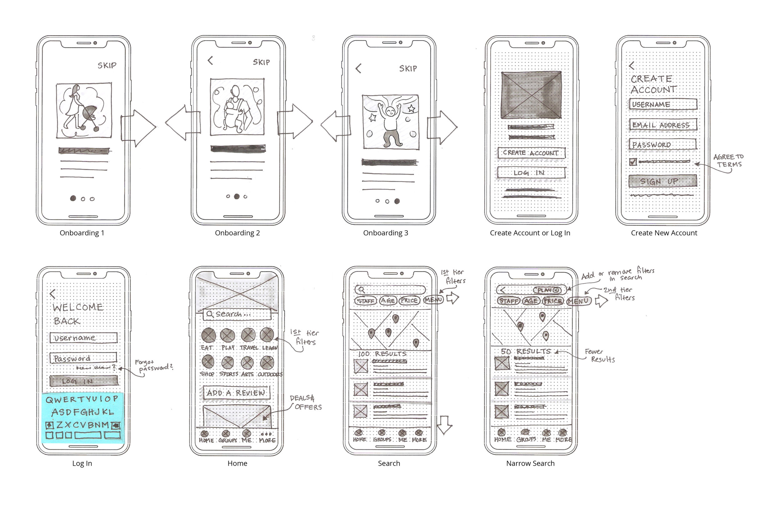
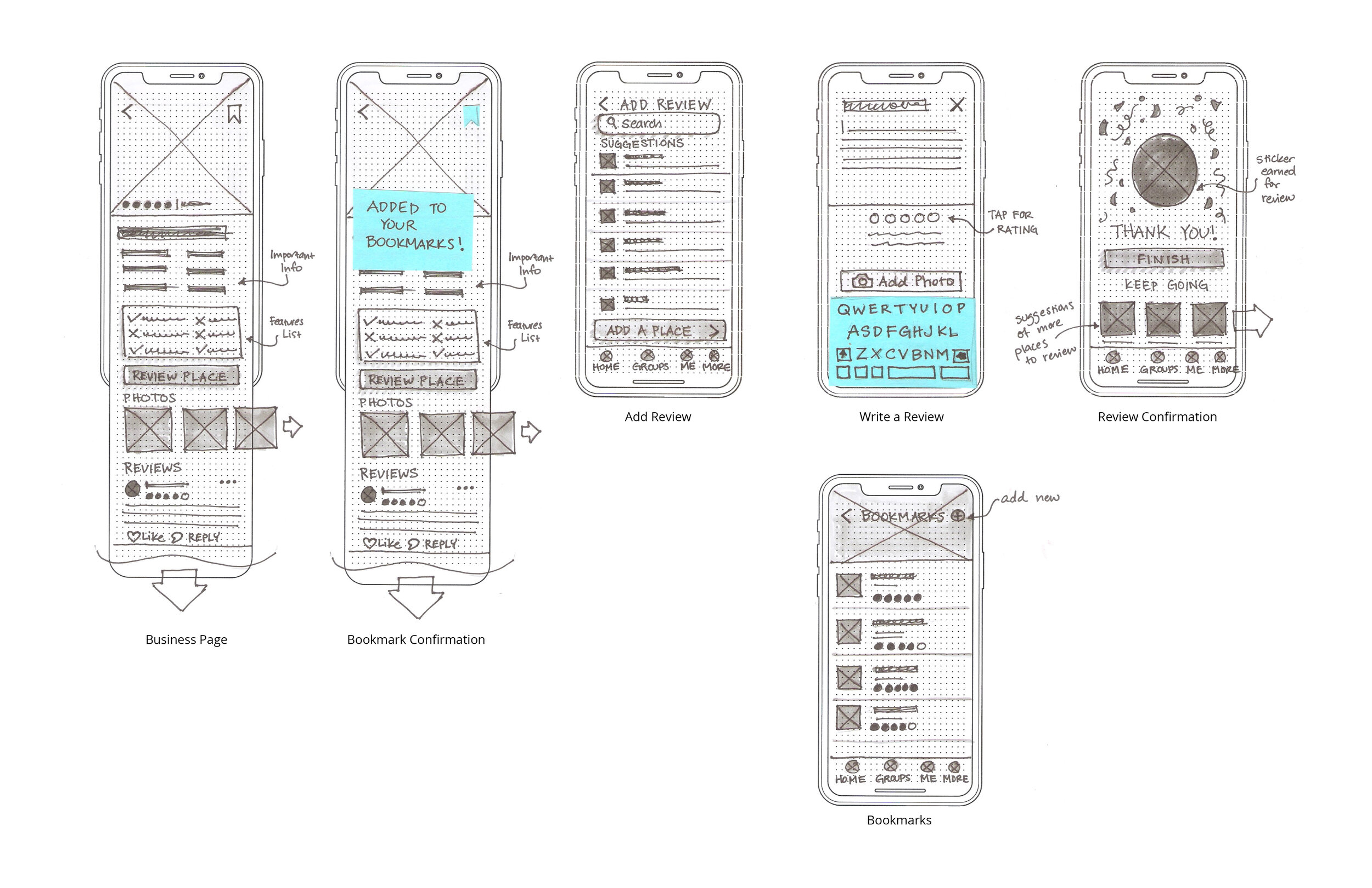
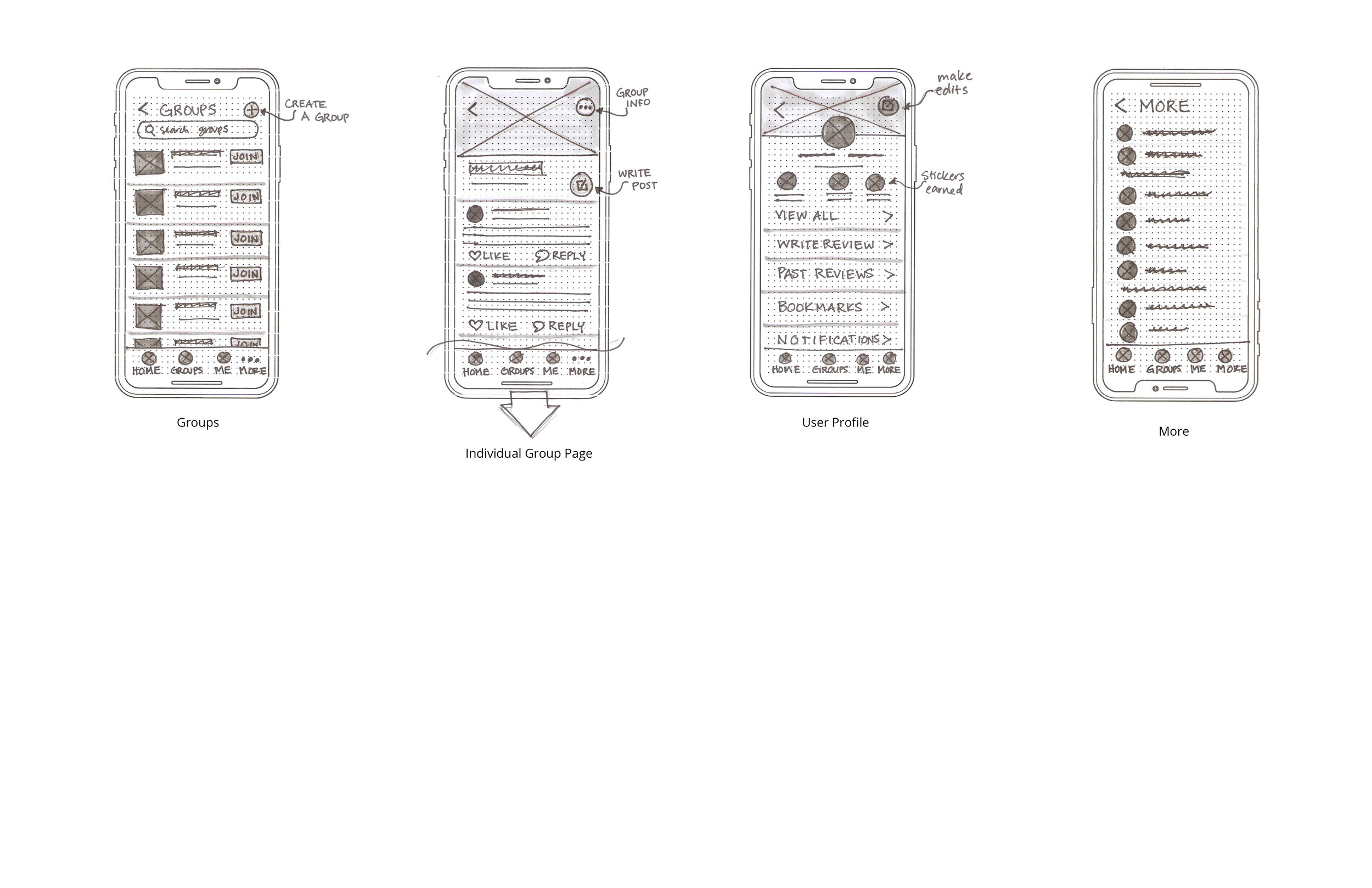
From the sketches, I mapped out where all the elements would go in the low fidelity wireframes. This was a great technique to define hierarchy and plan where content would be placed without being distracted by color.
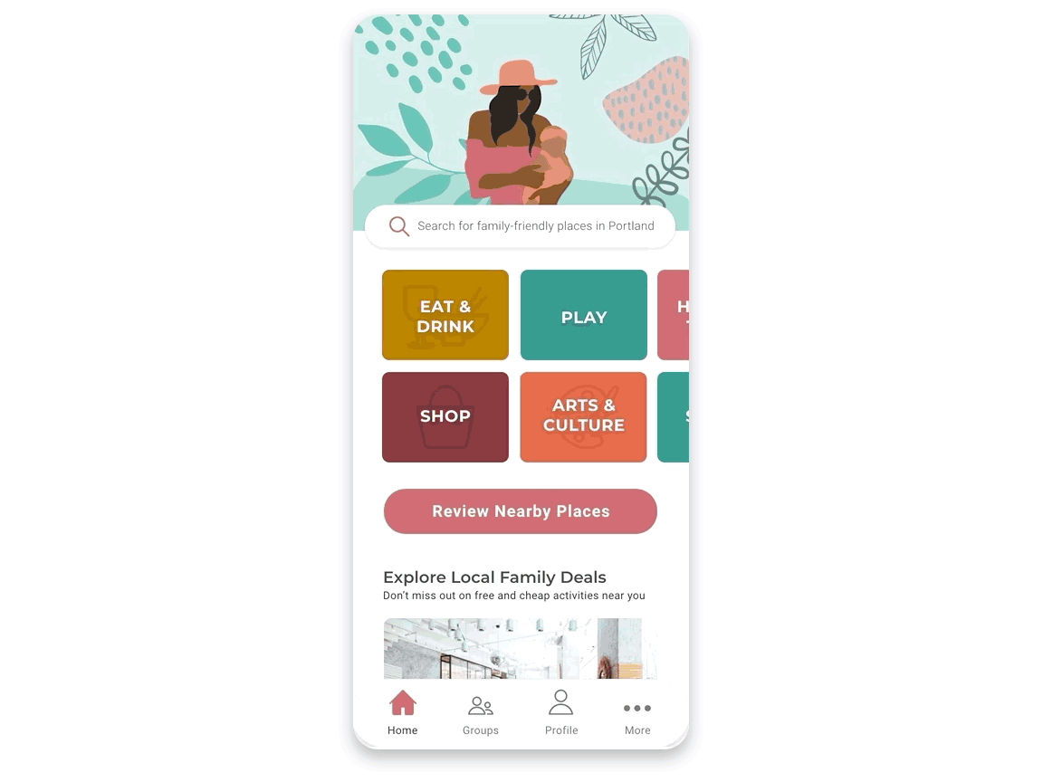
Branding & Identity
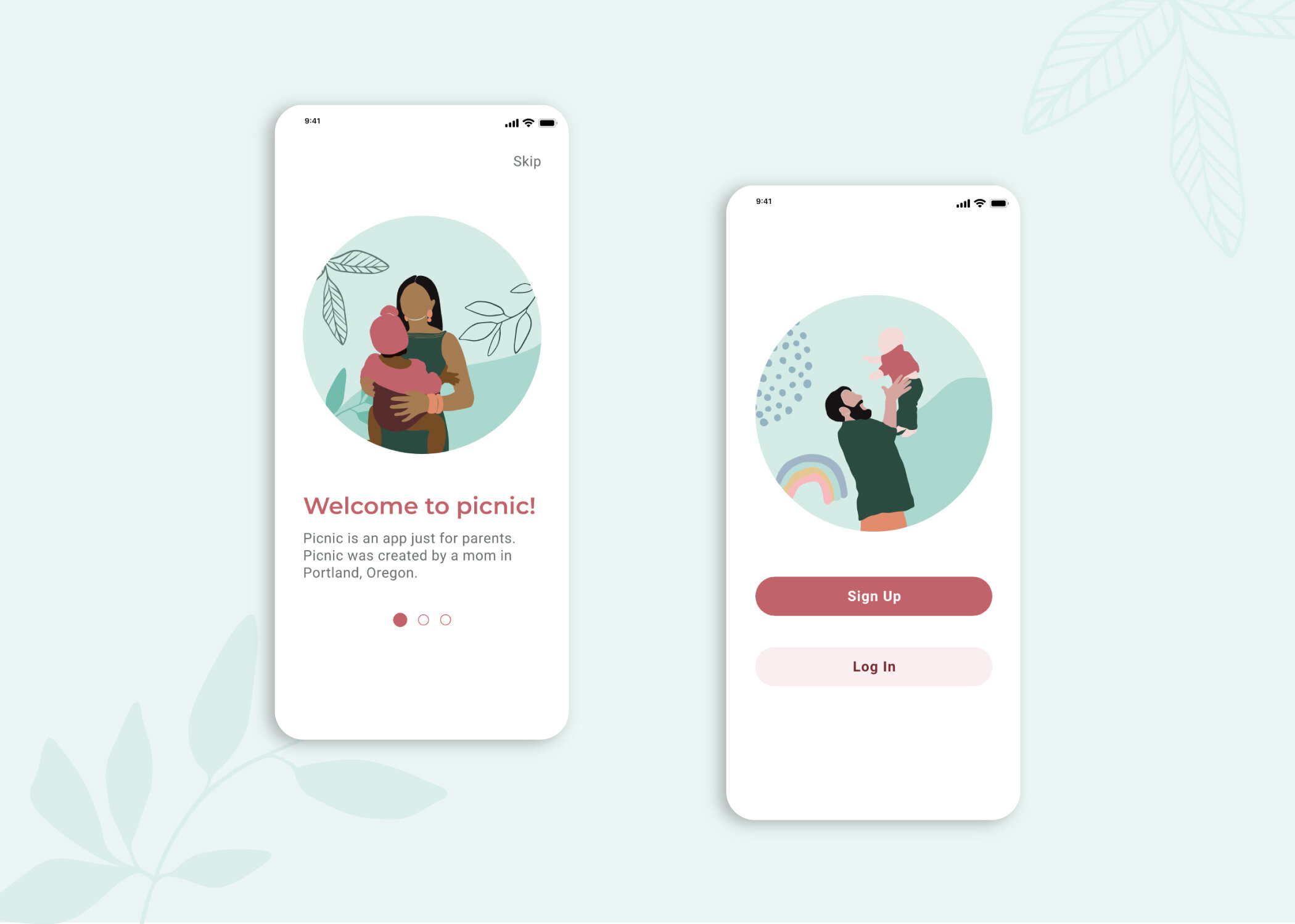
For the Picnic brand, I wanted to create a world where families feel safe, accepted, confident, and joyful. I wanted it to have a warm, cheerful, positive, welcoming, and accessible personality. It was important that the brand be extremely pleasant, clean, simple, and easy-to-use otherwise busy parents will not use it.
I communicated the brand values through the use of a warm, earthy color palette, thoughtful and inclusive images of parents and children, and rich typography with a clear sense of hierarchy.

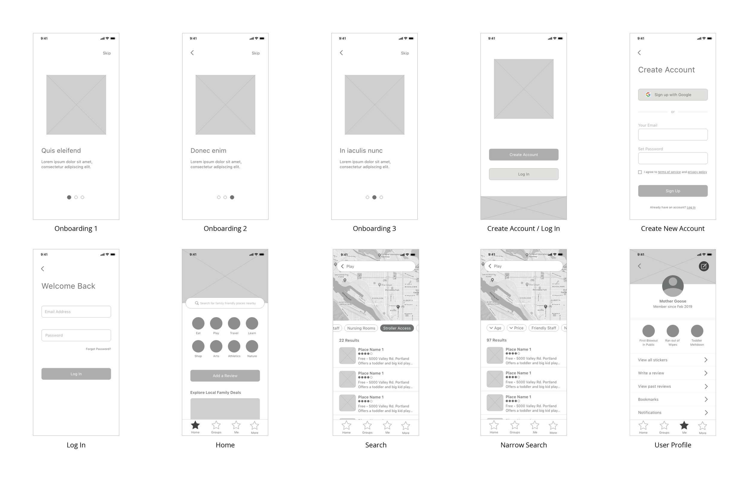
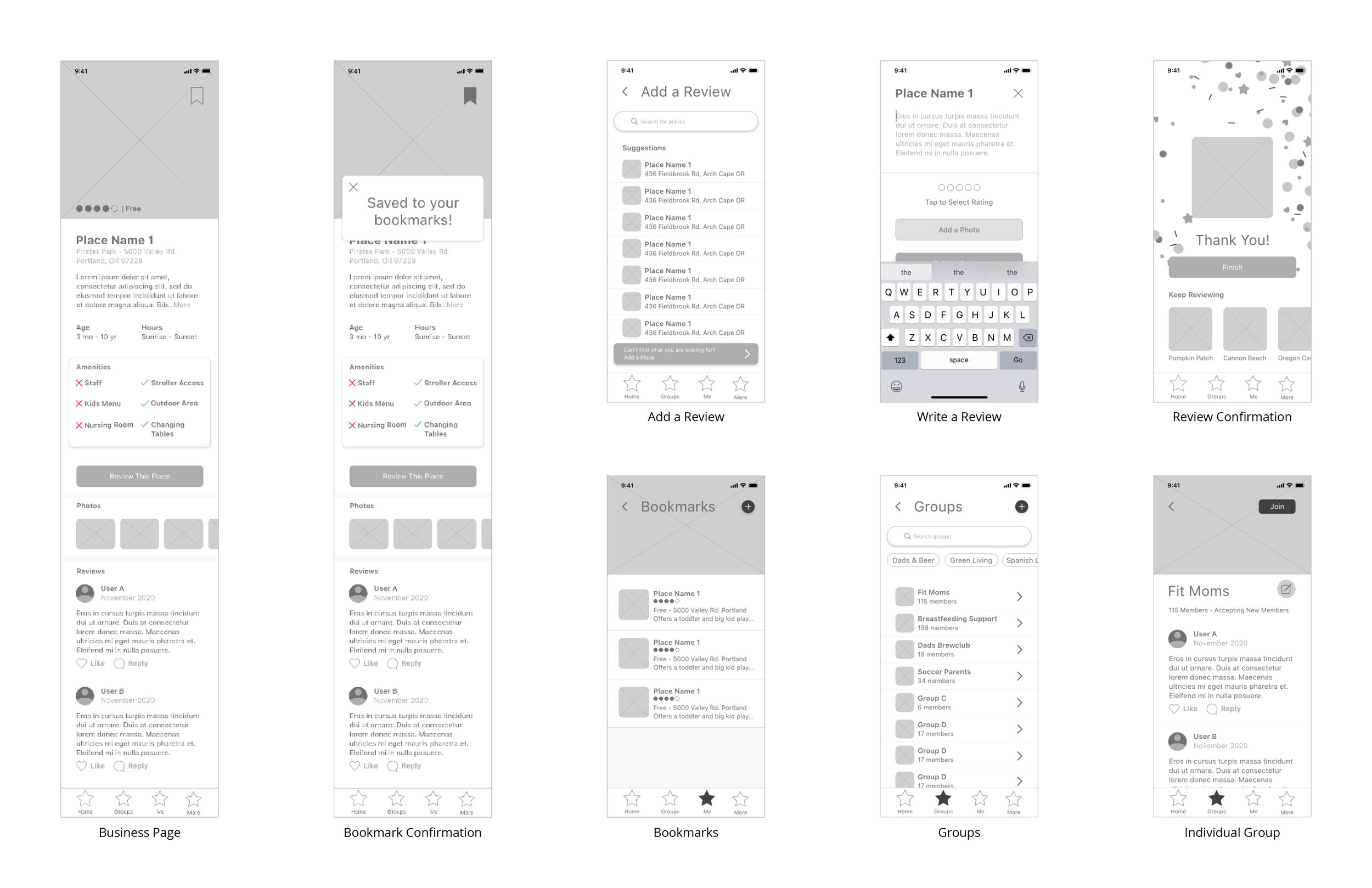
High Fidelity Wireframes
When I created the high fidelity wireframes, I kept WCAG 2.0 accessibility top of mind. I’ve been a pregnant and then nursing mom. I’ve also been on crutches post-surgery. I relied on my memories of those periods in my life, when I had to navigate an environment that was not built with those handicaps in mind, so I know firsthand the value of inclusivity in design. Creating high fidelity wireframes was the moment I could see Picnic coming to life. Putting the prototype together, with the addition of animations for micro-interactions, brought life and joy into the product. At this stage, I also learned about the importance of keeping everything organized and labeled clearly within the Adobe XD file.
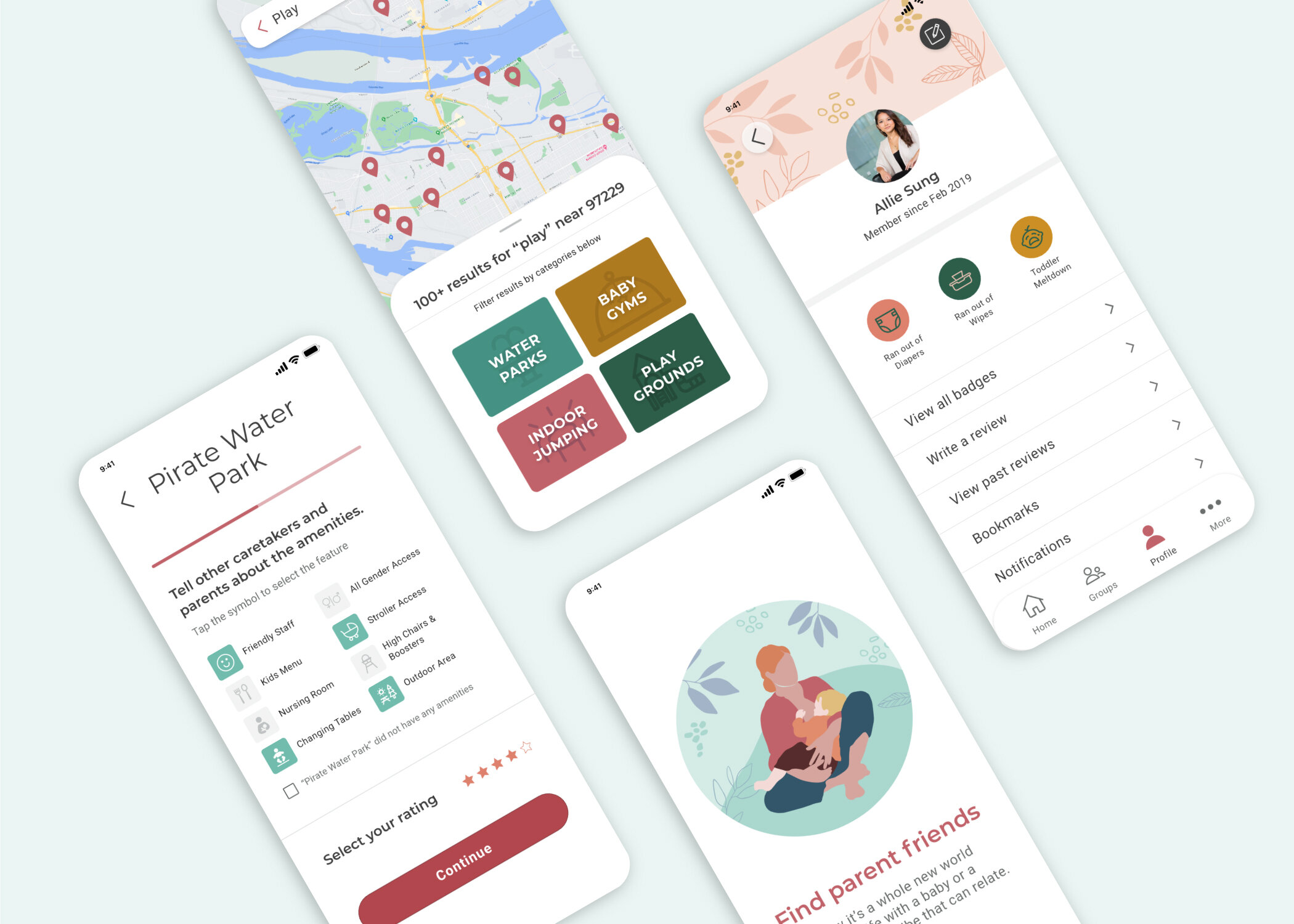
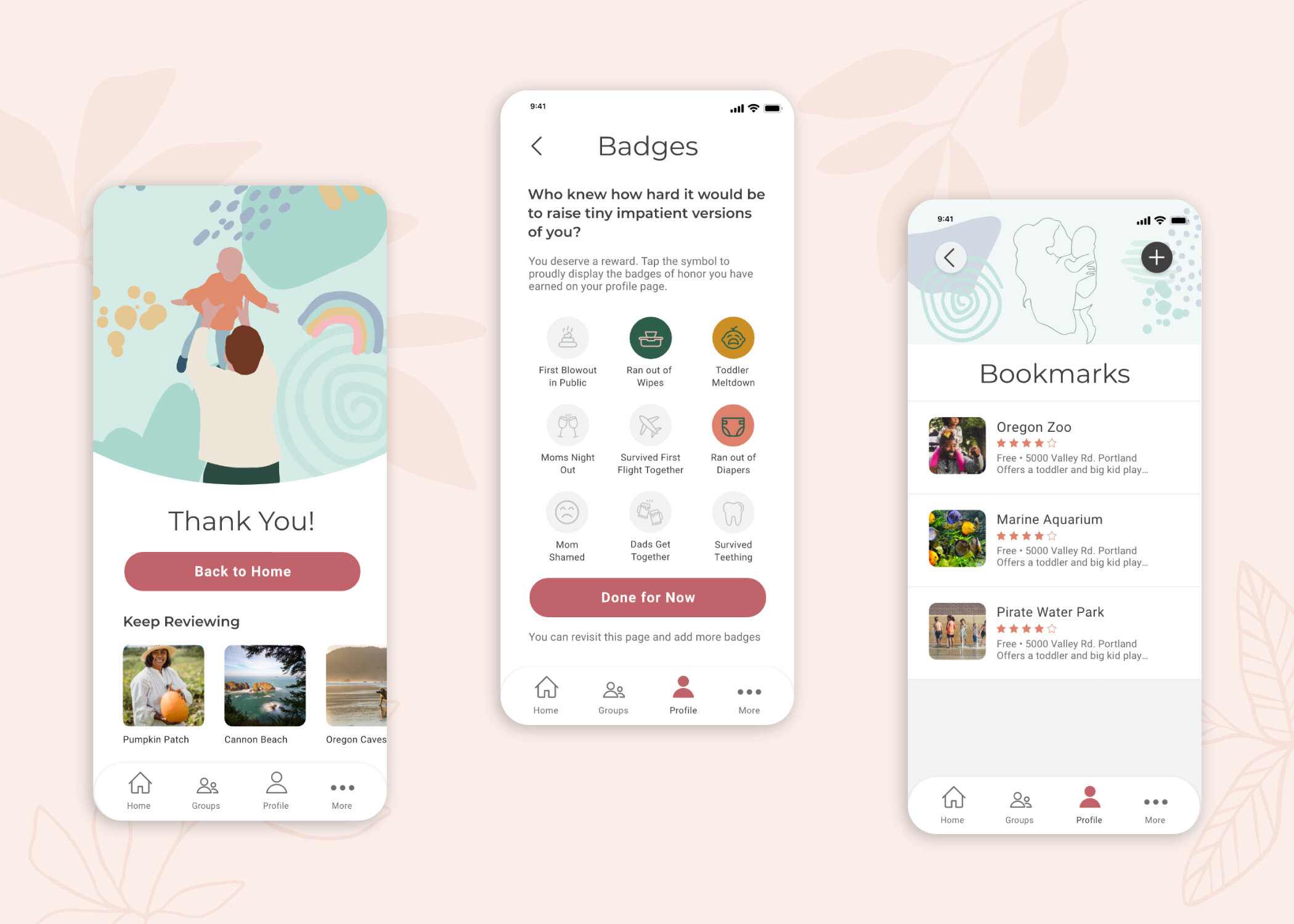
the Prototype

Delightful onboarding

Simple review process
Quick and easy search

Relatable reward system
VALIDATE: USABILITY TESTS
Round 1
Once the prototype was complete, it was time to test again. I executed two rounds of five moderated usability tests during February 2021. From Round 1 I learned:
The Last onboarding screen needed clearer language about what happens next.
Users wanted to see more details and functionality on the business pages.
There were some privacy concerns about the groups section, parents want to feel safe when posting information about their families.
Overall, tasks were completed easily and users commented that it was intuitive to use.
Finally, users responded really positively to the total look and feel.
Round 2
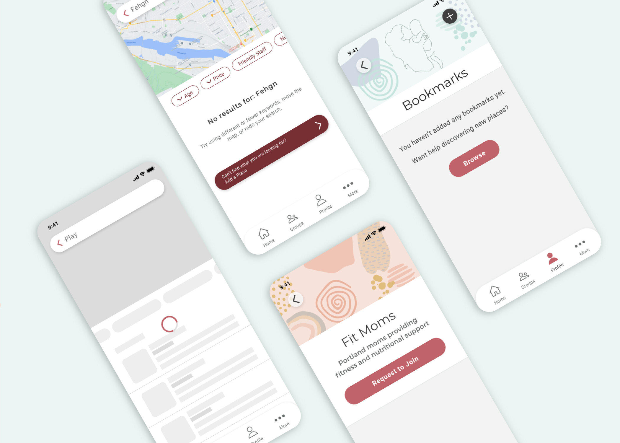
With user feedback in mind, I iterated on the design and set up testing for Round 2. I added more details and functionality to the business pages, I added a clear call to action on the last onboarding screen to move on to the sign up/log in page, and I added a process for users to earn badges to display on their profiles.
Many users were delighted with the badges and responded with laughter and smiles.
There was some concern about whether enough people would use the app for it to be useful.
One mom said, “This works the way that I would like it to. I am not a techie and I had no issues with it.”
One father commented that a lot of the placeholder text about dads also had language about alcohol. This was an important reminder about inclusivity and to not make assumptions that all fathers enjoy drinking socially.
Many users commented on the UI, calling illustrations “whimsical, pretty and inclusive” and overall layout “very clean.”
Lessons Learned
Parents are an underserved, yet important group of consumers. Parents today are busier than ever, dads are more involved with housework and childcare, and moms are bearing the brunt of the pandemic. There is saying that it takes a village to raise a child, but where is said village?
There are many potentials for digital solutions for parents’ pain points; Picnic is not the only solution. I mentioned earlier many parents expressed a desire for an app that helps rate and filter products due to the market saturation of car seats, strollers, bassinets, baby bottles, etc.
Parenting struggles are a broad topic and if I had more time for research, I would have also liked to explore other themes such as single parenting, technology, self-respect, and fostering independence.
Keep users involved throughout the process.
Don’t underestimate the importance of organization.
Check your assumptions. Perhaps I was too emotionally close to this project and assumed that all other parents feel or think the same way I do.
What’s Next for Picnic?
If this were a real product, I would hand off prototypes to developer at this stage.
Add an identity verification component to the onboarding process.
Continue with testing and iteration.
Measure success metrics, such as quantity of users, engagement with the app, and quality of reviews.
Partner with brick and mortar businesses – this product could be great for highlighting local businesses that are doing well and encouraging more businesses to think about how to better serve parents as an important consumer group.
Thank You
I owe heartfelt thank you’s to many people for helping me with Picnic. First, thank you to my mentor, Michel Loro, for answering every little question, teaching me new tricks, and pushing me to improve. Thank you to my village of mama and dad friends: Jordan, Shannon, Mary, Celeste, Kimberly, Ricardo, Lis N., Liz C., Vlad, Ilya, and Anna. You are all the inspiration for this project! Thank you to my Springboard buddies, we are embarking on this UX/UI adventure together! Thank you to my son Kai for choosing me to be your mama and teaching me humility. And most of all, thank you to Jon Pimentel for supporting me in this endeavor and being an all around a superhero dad and husband.
