portland magazine
CREATING AN IMMERSIVE DIGITAL EXPERIENCE FOR PORTLAND MAGAZINE
Project Background: Jessica Murphy Moo, Editor of the Portland Magazine, asked me to create a dedicated website for the Portland Magazine. She wanted it to be consistent with the ethos of the magazine: high-quality, deeply human stories; beautiful, clean, warm and thoughtful design; and an openness to the spiritual dimension in our lives. The website’s objective was to help readers immerse themselves in the stories by giving them the opportunity to interact with more content than can be shared in print: video, sound bites, additional photography, “behind the scenes” subject matter, and additional web links.
The Portland Magazine was completely redesigned in 2019 after a 2-year hiatus following the passing of beloved Editor Brian Doyle. We (the Marketing and Communications team) wanted to respect the original character and warmth of the Magazine, while adapting to current trends and technology in the reader’s experience. Our goal was to meet readers wherever they are at.

My Role: UX Research, Design, Usability Testing, Prototyping, Collaborating with Developer for Hand Off and Reviews
Tools Used: Miro, Adobe XD, Zoom
Audience: The target audience for the magazine website consists of University of Portland (UP) alumni, current readers, UP faculty and staff, current and prospective students, parents of students and community partners.
information architecture
The first step was to decide how to organize and structure the content of the magazine for a digital space. In the print magazine, the first thing the reader sees when they open the magazine is a table of contents for that specific issue, but the website needed a higher-level menu that accommodated multimedia content, as well as top-level categories for stories originating from multiple magazine issues. After several iterations of sketching, wireframing and testing, here is the final sitemap we came up with:

design: branding & identity
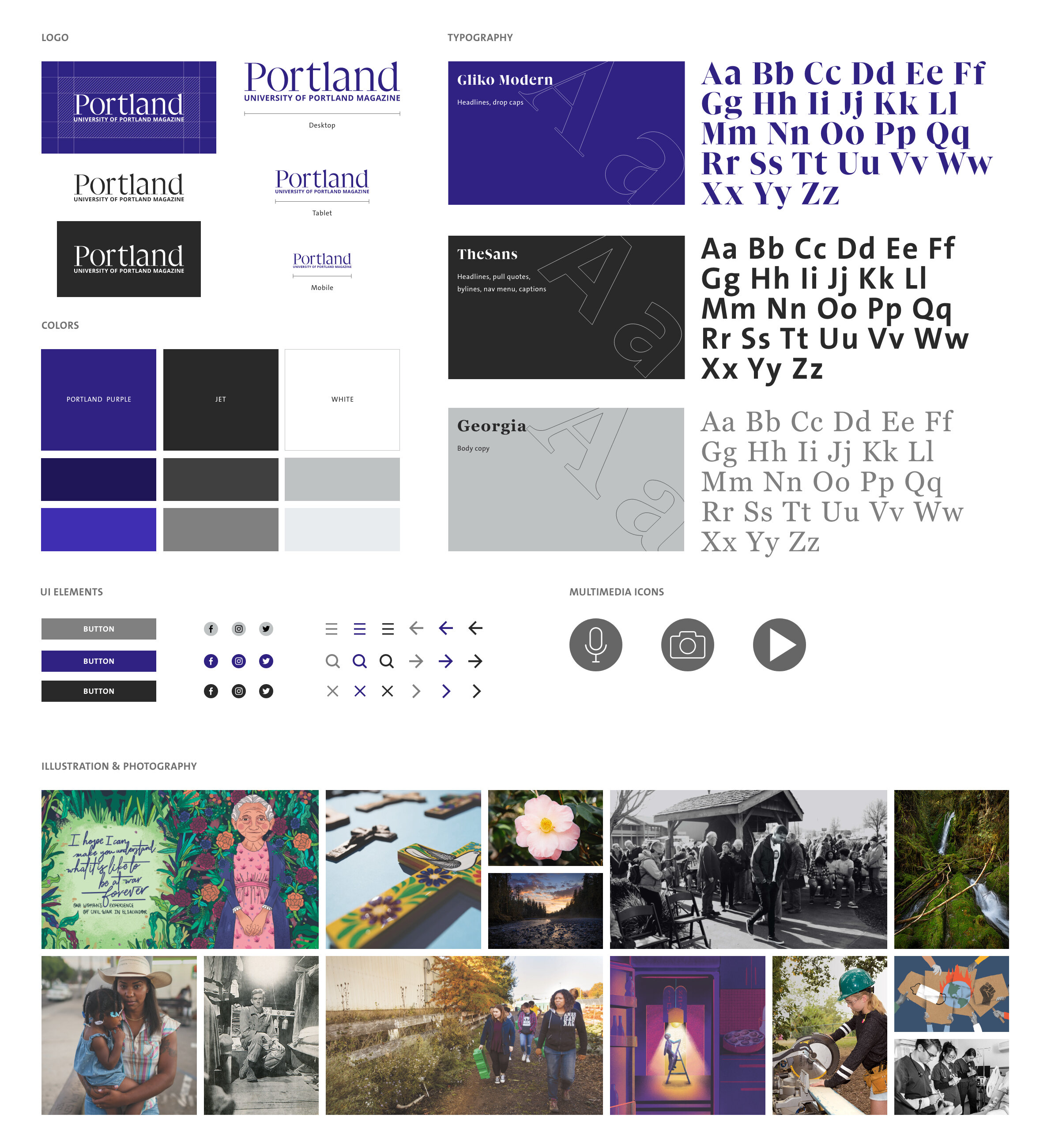
I communicated the brand values of the Portland magazine through a clean layout, rich and varied typography, and a limited color palette of grays, white and an accent color of University of Portland purple. I kept the color palette simple to allow the photography to take center stage. Gliko Modern is a font that was created specifically for editorial design and is the brand font for Portland Magazine. I used it for the headlines; however, we had some issues with Gliko’s legibility when it was used for big blocks of body copy. Its thicks and thins were too extreme and it became difficult to read. I decided to substitute good old, reliable Georgia for the body copy. To give contrast to the beautiful serifs, I also incorporated TheSans, which can be seen in the menu, meta data and headers for category pages.
usability tests
My team and I executed three rounds of five moderated usability tests during February 2021. We tested mobile, tablet and desktop. From testing we learned:
We had previously grouped all the multimedia content under the category “Portland Plus.” From testing we learned that users didn’t intuitively connect Portland Plus with multimedia. Even more troubling, the name Portland Plus was misleading. Some users thought it meant a subscribtion-based service, similar to Disney Plus, or content that was meant to be hyperlocal to Portland.
We had previously chosen a blue-green as the main accent color. We thought that the Portland Magazine’s separateness from the University of Portland brand was a strength, but it turned out that users were expecting to see their school purple. Our testers represented a broad spectrum of our target audience: faculty, staff, alumni and current students. This group of stakeholders are also the magazine’s biggest champions, so it was an easy decision to switch out the blue-green for UP purple.
There were some concerns about our decision to exclude content that wasn’t feature-worthy. Users were hoping to see some alumni and campus-specific content. This led to our decision to rework the sitemap and include an “On The Bluff” section as well as an “Alumni” section that could cover the most relevant campus stories and class notes.
Overall, tasks were completed easily and users commented that it was intuitive to use.
Finally, users responded really positively to the total look and feel and expressed excitement for the website’s debut.
final design
Here is the final prototype. Barkley REI is currently developing this site for launch in Fall 2021.

Video landing page across devices

Issues landing page and individual issue page design

Contact form responsive design


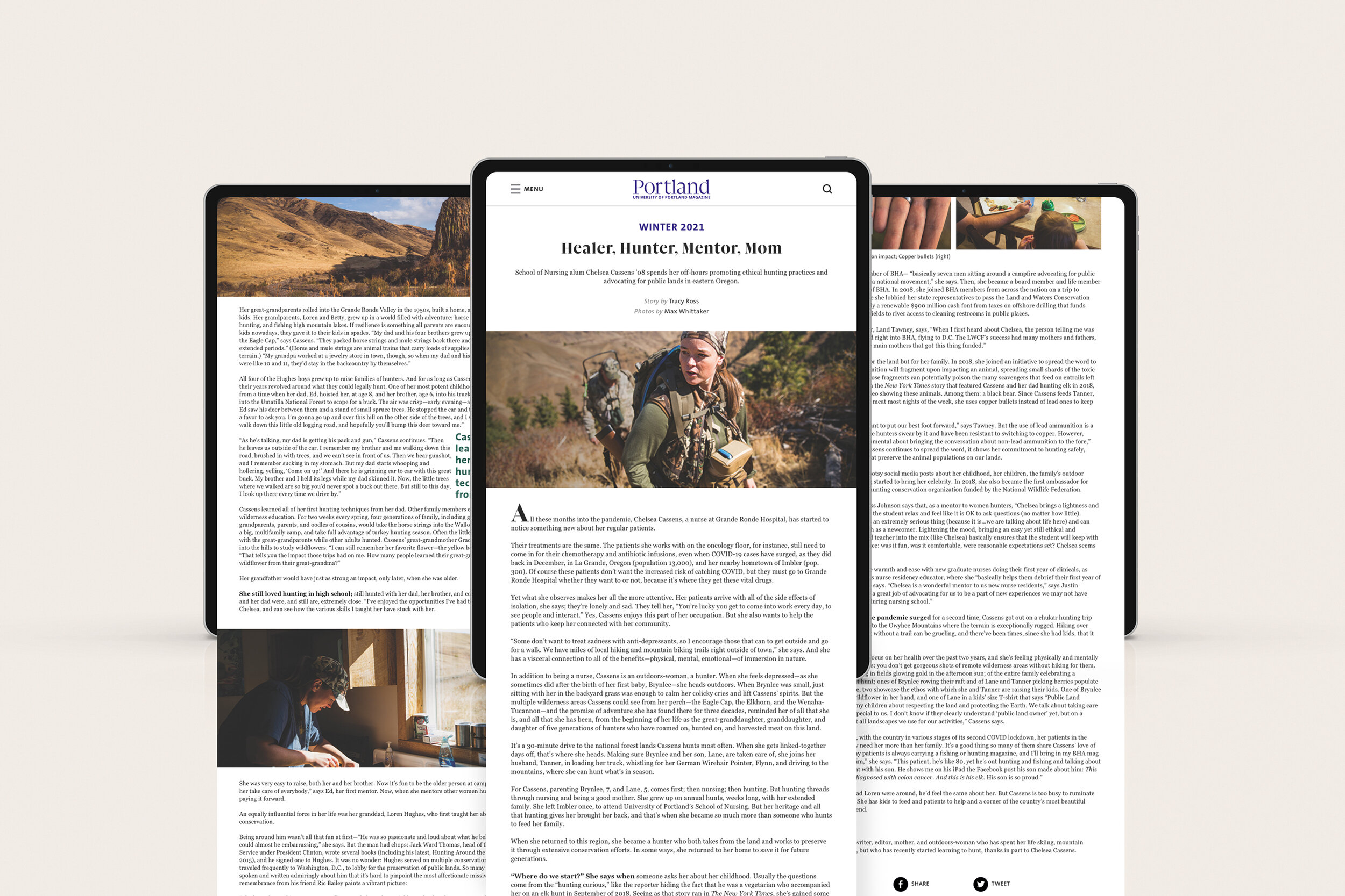
Pull quote behavior across devices
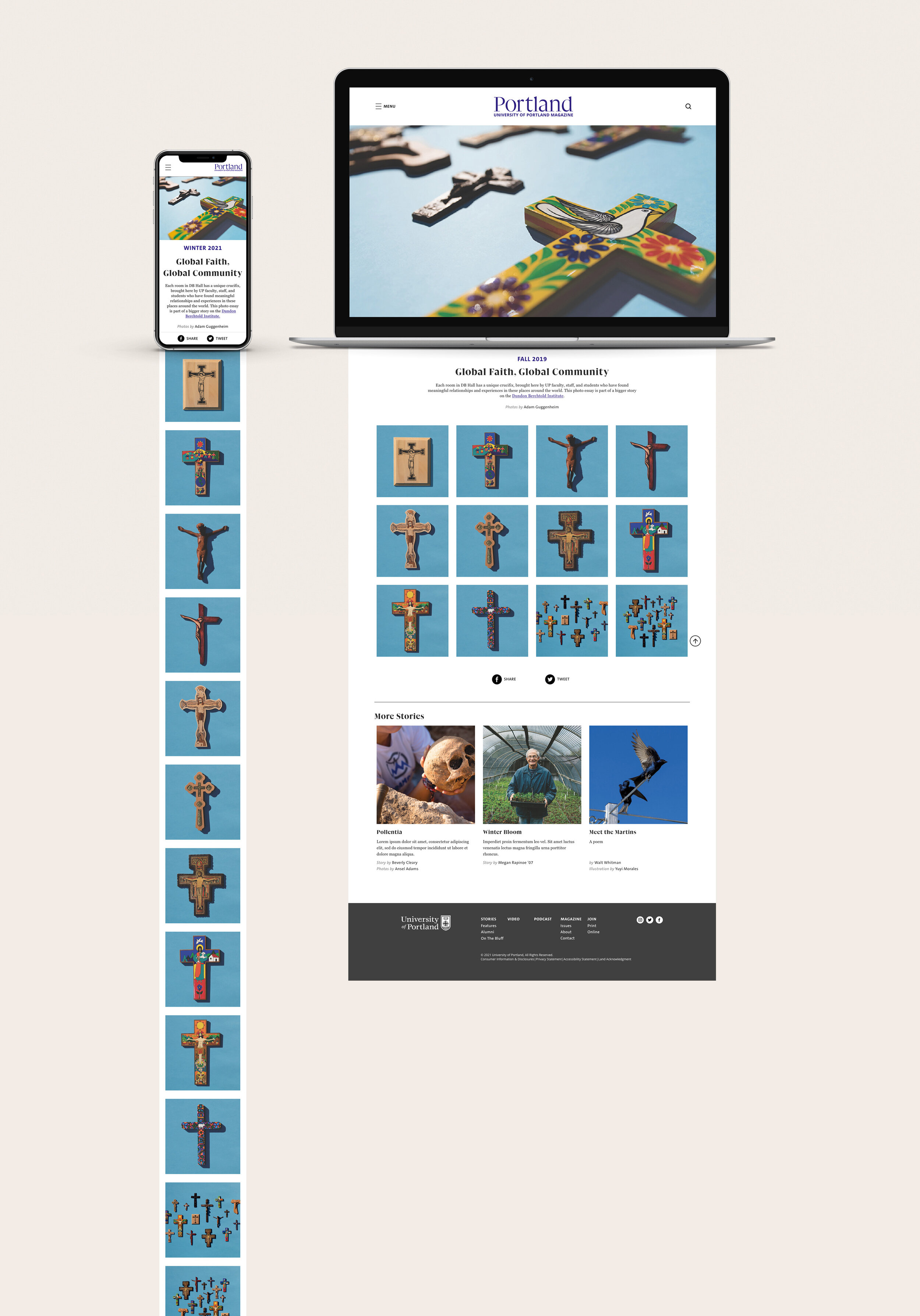
Photo essay page layout
Lessons Learned
I think the most important thing I learned during this process is how to work with a developer. I tried not to make assumptions about what they can or can not build, I consulted with them on what grid specs to use and what concerns they had, if any, from my wireframes. I managed appropriate font licensing and handed over a comprehensive design system, as well as clean Adobe XD files with clearly labeled character styles, components and layers.
There is a balance between brand loyalty and functionality / form and function. I mentioned earlier that Gliko Modern was not practical for big blocks of body copy on a screen. It looks great in headlines and print, but when our team took a step back and looked at it on a screen, we immediately knew that it would strain reader’s eyes and overall be unpleasant to read.
I am always learning and improving when it comes to web accessibility. WCAG 2.0 standards are always top of mind when I am designing, especially for University of Portland where it’s absolutely critical. However, I learned a few more details from this project to keep things as accessible as possible.
What’s Next for portland magazine?
Even though I am no longer an in-house designer at UP, I will stay on this project on a contract basis. We have a static site review scheduled for June 2021 and an interactive site review scheduled for September 2021. I hope to see the site launch in Fall 2021 and will keep in touch with my former colleagues to make sure everything is going smoothly. I can’t wait for the site to launch and hear about the magazine readers’ reactions!
thank you
I would be remiss if I didn’t thank my team at University of Portland: Jessica Murphy Moo, for trusting me with her “baby,” Karen Bridges for managing this unwieldy project and advocating for design every step of the way, my former boss and mentor, Patricia McDonald, and my current mentor, Michel Loro, who patiently answered all of my nit-picky questions, even questions I didn’t know how to articulate.