design & illustration
Before devoting myself completely to UX/UI and product design, I was a graphic designer for several years. From 2019 - 2021, I was an in-house designer at University of Portland. Many of the skills and processes from graphic design translate to UX/UI and product design. Here, I wanted to share some of my favorite projects.
Ok...Here Goes! Podcast
Ok...Here Goes! is a podcast from the Portland Magazine about following your gut and bracing for what comes next.
Client: In-house podcast team within the Office of Marketing and Communications
Audience: Readers of Portland magazine, University of Portland alumni, parents of current students, and UP faculty and staff ages 30 – 55, who love compelling, deeply human storytelling with an “Aha!” turning point, who have at least a 20 minute commute, and who are seeking connection to a community guided by a sense of hope.
My role: Designer and Illustrator
Tone and Visual Goals: Connect the mark to the Portland magazine/UP brand, but exist as a unique, stand-alone mark. The tone of the podcast is friendly, approachable, and informal. It will cover heavy topics, but build trust with the listener to help them work through the story and feel hopeful as each episode comes to an end. Each story includes a definite turning point, a moment of AHA!
There must be a before/after (an element of events that unfolded in a specific period of time).
The turning point must have an element of risk (the person is the driver of the turning point, he/she/they made choices).
Finally, the turning point must include something unexpected that emerged from following it (new path, new insight, something useful for today)
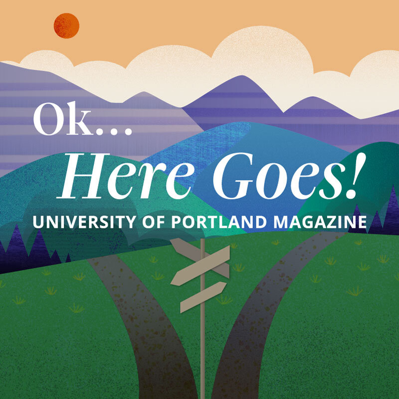

In my mind, the design challenge was twofold. Number one, I had to nail the typography and punctuation for the phrase, “Ok here goes.” Does it end on a question mark, a period or an exclamation point? Is there a pause between Ok, as if a person takes a deep breath before diving into the deep end, and Here Goes? I worked out the typography using Gliko and TheSans, the two typefaces used for Portland Magazine.
The second part of the challenge was the imagery. I experimented with several photos from the UP archives; however, we decided to go with illustration for it’s whimsical, storytelling qualities. Once we decided to go the route of illustration, I brainstormed several ideas starting with turning point. I kept coming back to an image of starting on a journey or a quest, which is how I came up with an idea for trails through a landscape. Because I wanted to achieve a sense of story, there is a foreground, middle ground and background, just as there are three parts to a story: beginning, middle and end. There are no figures in the illustration, so that the audience can place themselves within the landscape.
The story of the bluff
In 2019, I got the chance to lead the branding and art direction for University of Portland’s reunion, scheduled for June 2020. I went to work, setting a direction and hiring a fantastic illustrator, Hayden Walker, blissfully unaware of the deadly pandemic that would force us to cancel all in-person gatherings for the next two years. In 2021, I learned that this campaign won a bronze design award for illustration from the Council for Advancement and Support of Education.
Note from the Judges: This alumni reunion campaign captures one’s attention right away, with a limited but strong on-brand colour palette, and very nicely composed illustrative elements and scenes. The consistency in line weight, patterns and style across all elements is quite solid and technically well-executed. The stacked and curved typography in the feature element, used very well in several instances, is nicely balanced and is quite readable. This campaign is very well executed.


Client: Alumni Relations Team
Audience: University of Portland alumni, with a special emphasis on the Class of 1970 as it was intended to be their 50-year reunion
My role: Art Direction, Design
Tone and Visual Goals: Storytelling and place were paramount to the theme for the event, with alumni developing a deep sense of place during their time “On The Bluff” at University of Portland, and coming together again to share their stories and reminisce. We used both in- and out-of-house designers to create two custom illustrations of immediately recognizable landmarks and features from the University and Portland, OR area. These illustrations were intended to be broken down easily and reconfigured into different collateral with endless possibilities.


JUNIOR VIEWBOOK
The Wonder campaign was created specifically for the University of Portland by an outside agency with the goal of increasing admissions. The agency dictated the color palette, fonts, photography direction and linework, but it was up to me and the Senior Designer as to how to implement them. Each year, the Senior Designer and I were tasked with creating a suite of admissions materials: Senior Viewbook, Junior Viewbook, Financial Aid brochures, Campus Visit poster, etc. In 2021, I learned that the Junior Viewbook, for which I was the design lead, won a Circle of Excellence award from CASE.
Note from the Judges: The University of Portland’s viewbook beautifully and soberly conveys the university’s interest in the life of the mind, beginning with the cover statement, “when we wonder.” This theme—of wondering, of discovering, and then of taking the scenic route and breaking down barriers—develops throughout the viewbook, accompanied by an ever-changing kaleidoscope pattern. Through the use of ample white space and cooly toned photography, the viewbook intentionally turns down the volume and tells prospective students that Portland gives them room to think and explore.
Client: Admissions Team
Audience: Incoming first-years and their parents
My role: Designer

Viewbook cover with custom die cut

Selected spread from Junior Viewbook

Selected spread from Junior Viewbook, full bleed

Selected spread from Junior Viewbook, full bleed

Selected spread from Junior Viewbook
selected wordmarks
The following are some wordmarks I developed for special programming at University of Portland that required some unique brand visibility.
